Join Dataflo @ SaaS Insider's India 2022 on May 26 - 27
Register Now


As businesses generate and collect an ever-growing volume of data, comprehending and effectively utilizing this data becomes paramount. This is where a data visualization dashboard comes in.
As a powerful tool, it provides a user-friendly, graphical representation of critical data that helps uncover insights, track performance, and guide strategic decisions.
But the journey to creating an impactful dashboard begins with choosing the right tool. From an array of available options, each offering unique features and capabilities, selecting the most suitable one can seem daunting.
This blog provides a comprehensive understanding of these dashboards. It presents a curated list of the top tools in the market that can assist in creating an effective data visualization dashboard.
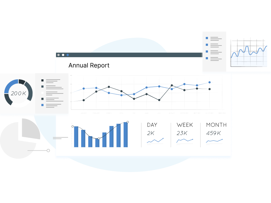
A data visualization dashboard is a dynamic tool that visually showcases vital metrics, performance indicators, and other crucial data bits to track and analyze a business's health or process.
These dashboards are tailored to suit an organization's specific requirements and provide an up-to-date snapshot of its performance. By representing data in the form of maps, charts, and graphs, dashboards decode complex data sets and offer users a quick overview of current performance, fostering well-informed decision-making.
The benefits of data visualization dashboards extend well beyond their ability to render data in a visually engaging manner. These versatile tools can fundamentally reshape business operations, instigating more informed decision-making processes and catalyzing the transition toward becoming a more data-driven and successful organization.
Let us look at some benefits of using a data visualization dashboard.

Enhanced Data Interaction: Think of interactive dashboards as your playground for data. They allow you to play around with the data on display, dig deeper into specifics, and draw conclusions. This level of interactivity enables a more profound understanding of your data, leading to more insightful findings.
Alignment and Collaboration: Dashboards are like the North Star for teams, highlighting KPIs that mirror an organization's strategic goals. This clarity promotes a shared understanding and encourages teamwork, ensuring everyone moves in the same direction.
Increased Data Accessibility: The beauty of dashboards is that they act like a central hub for all your data, making it easily accessible to everyone in the organization. This easy access fosters a data-driven culture; everyone can use data insights to guide decision-making.
Time-Saving: Time is money, and dashboards save you plenty of it. They take on the task of aggregating and presenting your data, eliminating the tedious job of manual data collection and compilation. This efficiency lets you focus on drawing insights and making decisions rather than wrangling data.
Historical Analysis: Dashboards are not just about the here and now. They often come with tools for examining historical data and tracing patterns and trends. This long-term view can give you valuable insights into seasonal trends, growth rates, and the impact of past decisions.
Improved Decision-Making: The key to smart decision-making is understanding your data, and dashboards are a big help with this. By turning raw data into visually appealing, easy-to-understand formats, dashboards make it easier for you to derive meaningful insights and make informed, data-backed decisions.
Real-Time Data Monitoring: Staying on top of trends or potential issues is a breeze with dashboards, thanks to their real-time data tracking capabilities. This means you can respond quickly to emerging trends or nip problems in the bud, keeping your business agile and responsive.
Dashboards are not all created equal. They come in various types depending on the purpose and cater to different informational needs. Understanding these distinct types is essential to select the most appropriate dashboard for your business context.
Let us explore the various types of data visualization dashboards, their unique features, and the contexts in which they are most effective.
A Founder/Executive KPI Dashboard is a strategic tool providing comprehensive insights into an organization's performance. Used by key executives, it monitors vital KPIs such as revenue, profit margins, customer acquisition cost, and more.
It aids in identifying trends and potential issues, enabling strategic decision-making aligned with the company's growth objectives. The dashboard's ability to condense extensive data sets into an easily understandable format allows quick business health assessment.
A Sales KPI Dashboard is an analytical tool used by sales leaders to track key metrics like sales revenue, growth, regional sales, and conversion rates. A clear view of complex sales data allows a swift understanding of sales performance. Aies trends and areas needing improvement, guiding strategic decision-making, optimizing strategy, and propelling sales growth and efficiency.
Dataflo Sales Dashboard offers a unified view for sales funnel performance tracking, KPI monitoring, automated reporting, and seamless collaboration, all tailored to simplify your analytics process.

A Marketing KPI Dashboard is a visual tool utilized by marketing professionals to track and assess essential metrics such as customer acquisition costs, return onmarketing investment, lead conversion rates, and social media engagement.
For example, marketers build ad campaign dashboards on tools like Looker Studio to track and optimize their ad campaigns.
The marketing KPI dashboard simplifies complex marketing data, aiding marketers in swiftly understanding campaign effectiveness. Its critical role is in identifying trends and potential improvement areas, informing strategic decision-making, and enhancing marketing efficiency and results.
A Customer Success KPI Dashboard is an analytical tool used by customer success managers and teams to track crucial metrics such as customer satisfaction score, churn rate, customer lifetime value, and net promoter score.
The dashboard identifies performance trends and areas for improvement, guiding data-driven decision-making and boosting customer retention and loyalty. It distills complex data into understandable insights, which enables swift evaluation of customer satisfaction and retention efforts.
A Subscription KPI Dashboard is an analytical tool primarily used by subscription-based businesses to monitor key metrics such as Monthly Recurring Revenue (MRR), Customer Acquisition Cost (CAC), Churn Rate, and Lifetime Value (LTV).
This dashboard fosters strategic planning and helps enhance customer retention and revenue growth by identifying trends and potential areas of concern. It provides a quick, comprehensive view of subscription performance, aiding decision-making for business leaders.
A Content KPI Dashboard is a monitoring tool that content managers, marketers, and strategists use to track crucial content performance metrics like engagement, click-through, bounce, and conversions.
The dashboard identifies performance trends and areas for improvement, informing content optimization decisions and enhancing the overall impact and reach of the content. Distilling complex content data into actionable insights aids in swiftly assessing content strategies' effectiveness.
A Paid Attribution KPI Dashboard is a data visualization tool that digital marketers, media planners, and marketing executives use to track key metrics associated with paid marketing channels. Some of the KPIs that are tracked on a paid attribution KPI dashboard are cost per click (CPC), cost per acquisition (CPA), return on ad spend (ROAS), and conversion rates.
This dashboard simplifies the analysis of paid marketing performance, enabling users to gauge the effectiveness and ROI of their paid campaigns quickly. The dashboard also identifies high-performing channels and ads, aids strategic decision-making, optimizes ad spend, and ultimately improves marketing efficiency and results.
A Funnel Dashboard is an analytical tool used by marketing and sales teams to track and visualize the effectiveness of conversion processes, from lead generation to customer acquisition.
By displaying key metrics such as the number of prospects at each stage and conversion rates, it allows a quick understanding of where potential customers are dropping off in the conversion process.
The dashboard is essential as it helps identify bottlenecks and opportunities for improvement in the funnel, informing strategic decision-making, enhancing conversion rates, and ultimately boosting revenue.
Building an effective KPI dashboard requires a methodical and strategic approach. You must consider several crucial factors, including comprehending your data thoroughly, identifying pertinent Key Performance Indicators (KPIs), and selecting the most suitable forms of visual representation.
Let us discuss some tips on building a data visualization dashboard that accurately reflects your data and yields powerful insights.
Building a data visualization dashboard starts with defining your goals. Defining your goals is crucial as it sets the direction for what data to include, how to present it, and which metrics to prioritize, ensuring the dashboard is tailored to meet your unique business needs and objectives.
You need to understand what specific questions you want the dashboard to answer and what decisions it will inform.
Collecting and pinpointing the relevant data sources that match your established objectives, from internal databases and spreadsheets to external APIs and cloud services, is necessary. Guaranteeing your data's accuracy and recency is paramount at this stage.
This is because the quality and timeliness of your data are directly connected to the reliability and value of the insights that your dashboard will eventually provide.
Key Performance Indicators (KPIs) are specific metrics that align with your established goals and will drive your decisions. KPIs could range from sales revenue and customer retention rate to website traffic and social media engagement, depending on your industry and objectives.
This stage is critical as choosing the right KPIs ensures that your dashboard focuses on the most valuable information for your business.
Data visualizations include graphs, charts, maps, or infographics, and they should be chosen based on what best represents your data and KPIs. This decision is critical as the right visualizations can significantly enhance the interpretability and usability of your dashboard, facilitating better data-driven decision-making.
The goal is to present your data in a way that is easy to understand and effectively communicates the insights you want to convey.
The dashboard layout should be intuitive and user-friendly, grouping related data and placing the most critical metrics in prominent positions. Using colors, fonts, and space makes the dashboard visually appealing and easy to read.
The design phase is essential because a well-structured and attractive dashboard improves user engagement and facilitates quicker understanding and interpretation of the data.
While building your dashboard, you can utilize a data visualization tool, dabble with programming languages, or outsource the task to a professional developer. Crucially, your chosen approach must enable the realization of your outlined design and effectively support your selected visualizations.
This step is integral because it signifies the transformation of your planned design into an operational tool that can furnish key insights, thereby facilitating data-driven decision-making.
Data visualization dashboards are crucial in collecting vast amounts of information, turning complex datasets into intuitive, easy-to-understand visuals that facilitate better decision-making.
This process simplifies data interpretation and enhances the communication of findings, ensuring everyone across the organization can leverage these insights. Let us look at some of the best marketing data visualization tools, emphasizing their unique features and how they aid businesses in harnessing the true power of their data.

Dataflo is an advanced analytics software that collects and organizes data from diverse sources like CRM, marketing analytics, and sales intelligence applications into a single interface.
With its user-friendly design, Dataflo delivers clear insights into your marketing campaigns' performance, enabling swift and effective goal attainment. Dataflo automates routine tasks by simplifying data collection and offering tailored data that aligns with your requirements.
The custom dashboard feature allows effortless visualization and tracking of essential metrics and KPIs, facilitating a comprehensive understanding of business trends. By providing instant access to crucial alerts, notifications, and reports via email and Slack, Dataflo ensures informed decision-making, confirming its position as a superior data visualization and analysis tool.

Databox is an exceptional business analytics tool that facilitates identifying and analyzing marketing trends and overall business performance, ensuring data-driven decision-making. The user-friendly interface provides quick access to information while accommodating data collection from various sources, including Google Analytics and HubSpot. Additionally, data can be conveniently imported from the Databox database, providing a comprehensive view of your business's operations.
The platform offers an in-depth examination of your company's functions, supplemented with weekly summaries, daily scorecards, and alerts, keeping team members apprised of the company's performance. Its 'Drag-and-Drop' feature allows the creation of custom dashboards to track essential data from different sources within a single interface.
With varied pricing plans, Databox caters to small and large businesses, proving advantageous for marketing professionals who rely on data-driven insights for informed decision-making.

Klipfolio, a cloud-based solution, provides extensive data visualization capabilities, making it an ideal tool for product and marketing teams. It allows all crucial data to be visualized within a single interface, promoting more informed business decisions. Moreover, Klipfolio extends beyond data visualization, encompassing data exploration and historical data analysis.
This platform stands out for its wide range of prebuilt templates, which facilitate the creation of customizable dashboards. Users can create diverse visual data representations like graphs, maps, and charts from multiple data sources using its intuitive Drag-and-Drop feature.
Alongside custom dashboards, Klipfolio offers features such as PDF report generation, mobile monitoring, email snapshots, and the ability to view data from various channels, ensuring a comprehensive understanding of your business's operations.

Looker Studio is a data analytics tool allowing you to craft and share reports and dashboards swiftly. This enables quick analysis of your data at varying levels without the necessity for coding or web development expertise. Its customizable dashboard allows you to alter the color scheme, incorporate charts and tables from an extensive library of options, and select from hundreds of templates.
Being remarkably user-friendly, Looker Studio ensures that reports and dashboards are easy to create and effortless to share and embed into other websites. This proves particularly beneficial for marketing teams, facilitating project collaboration and enabling sharing of reports with clients.
It assists companies in tracking sales performance and identifying the types of content that generate maximum engagement on social media platforms. As a result, Looker Studio provides businesses and teams with a fast and adaptable method to analyze their data, promoting accelerated decision-making.

Geckoboard is an exceptional data visualization tool that allows you to closely monitor your company's performance by consolidating multiple metrics on a single dashboard. Geckoboard also facilitates the creation of customizable dashboards tailored to your specific needs.
This feature allows you to select from over a hundred chart types and additional tools, including those that display geographical information.
In addition to the extensive chart options, Geckoboard also offers widgets, enabling viewing specific data points without the need to sift through multiple reports. To further enhance its user experience, Geckoboard provides a 'Send to TV' feature.
This unique capability lets you project your dashboard on an external screen by pairing it with your account, making the analysis process more efficient and interactive.
In today's data-driven business landscape, opting for the right tool that aligns with your business requirements is essential. You must comprehensively research data visualization tools most suitable for your company.
This meticulous investigation will certainly reap profitable results in the long term, fostering a more streamlined, efficient, and informed decision-making process within your organization.
If you are pursuing a sleek, clutter-free data visualization tool, Dataflo presents an excellent choice. Equipped with a customizable dashboard and an array of compelling features, Dataflo is adept at helping you monitor your business performance effectively. Start your free trial with Dataflo today!


Ira is a writer and blogs about her love of words. She has been responsible for creating powerful and effective content that attracts and retains customers. A blend of her humble writing experience and an endeavour to inspire people with her words is on her table now. She is an avid reader and a music lover too. She loves to devote time each day to yoga and meditation in addition to going for walks.