Join Dataflo @ SaaS Insider's India 2022 on May 26 - 27
Register Now


In this competitive world, data is king, and the companies that know how to track their data efficiently and key metrics grow their business exponentially.
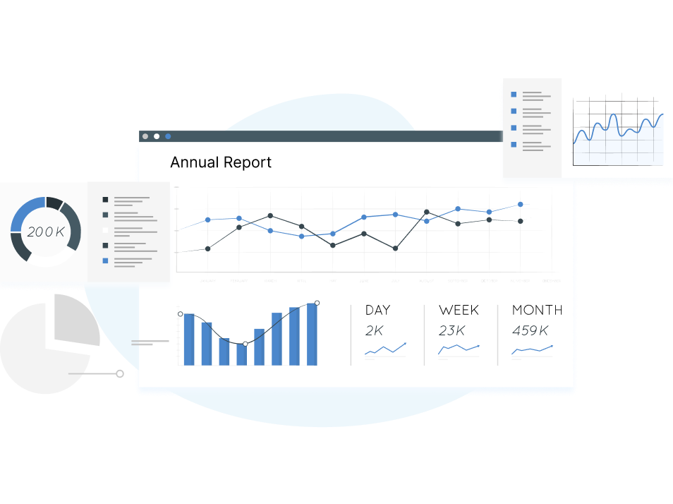
Data visualization helps you view your data creatively, allowing you to analyze better, understand, and share it with your team and stakeholders. It will enable you to present raw data in a visually appealing manner with the help of charts, graphs, maps, and so on.
Viewing data in such a manner makes it easy for businesses to track patterns, trends, and other insights in the data effectively.
Various data visualization tools in the market make data more accessible through customizable dashboards, integrations with multiple applications, and instant notifications.
To assist marketers, we have compiled a list of the 8 best marketing data visualization tools.

SaaS companies depend highly on data and metrics to better understand how their business is performing. Data visualization tools collect and display all the critical data and provide insights to the companies. This makes it easier for companies to analyze and communicate the data resourcefully.
Data Visualization tools also enable companies to formulate better marketing strategies to align them with their business goals. Here are some ways in which data visualization tools prove to be beneficial to SaaS marketers:
.png)
Related: Have you been looking for a better alternative to Looker Studio? Check out our blog on why Dataflo is a better alternative for data visualization than Looker studio.
Although data visualization tools simplify and showcase raw and complex data, there are several pitfalls that you need to consider before opting for one. Let us look at a few challenges that companies might face while using data visualization tools:
However, datasets tend to deviate from the typical bell curve to a minimal degree, at the very least. Such deviations will skew the average much more than the median. For this reason, it is essential to consider both the mean and the median in data visualization.
Related: Have you been considering Databox as your potential data visualization tool? Before you jump in and strike a deal, check out our blog on the top 5 alternatives for Databox.
[Data visualization tools make raw data comprehensible and visually appealing. Companies can customize their dashboards and display their most important metrics to get a better understanding of how their company is performing financially.
While there are several data visualization tools in the market, here are some of the best tools to help analyze, track, and gain insights from your data to make your company flourish.]

Dataflo is a visualization tool that lets you visualize and analyze your GTM metrics from various data sources. Companies can perform an in-depth analysis and comparisons of organized data in a single compact interface.
It efficiently compares complex datasets and provides detailed insights into their relationships in real time. This enables companies to analyze the insights and make informed decisions. The user-friendly interface helps companies achieve their goals by offering an overview of their marketing strategies.
Dataflo’s custom dashboard allows you to visualize all your essential metrics in one place. It also allows you to track critical KPIs over time to grasp marketing trends and patterns effortlessly.
Dataflo also automates tasks such as collecting data and visualizing it. Detailed reports and insights on customer behavior help you understand your business thoroughly.
With Dataflo, you can receive instant alerts, reports, and other vital notifications through email and Slack.

Looker Studio, is a data visualization tool that lets you create interactive dashboards, presentations, and reports. It collects and displays data from multiple sources through graphs, charts, and maps.
Another exciting feature of Looker Studio is that they offer dynamic reports that update automatically when new data is added. This saves your team the hassle of creating new reports each time they get new information.
Collaboration between teams is easy as the insights become accessible to everyone in real-time. The dashboards and reports can be shared easily to help your team focus on vital metrics. You can also schedule the reports to be emailed to the team members on a specific date and time.

Datapine is an interactive data visualization tool that allows you to access the organization’s data through relevant dashboards. It is ideal for data analysts who must build complex analytical processes and showcase quick results to their stakeholders.
With integrations to several external applications, Datapine makes it effortless to collect and analyze data to gain insights for your business. They also have online reporting software that enables you to create and share reports with your teammates in just a few clicks.
You can embed your Datapine dashboard into your website, intranet, or your own application to enhance your user experience and reporting processes. Datapine also allows you to customize your interface based on your client’s branding requirements.
Datapine also offers more than 80 templates to create your dashboard according to your company’s needs. You can access these dashboards from anywhere around the world without having to export the data each time. They evaluate your data and provide resourceful insights within a few minutes.

Octoboard is a cloud-based data visualization tool that enables companies to visualize, analyze, and share data and reports collected from various data sources.
Businesses can analyze and configure information in a clear and compact manner. Companies can easily visualize important metrics on their customizable dashboards. They can choose from over 200 templates or create a new one from scratch.
Team collaboration is effortless with their ‘Share Data on TV’ feature. All the relevant data can be displayed on the office TV, and the device can be managed on Octoboard directly.
Octoboard also offers multiple widgets from numerous cloud-based integrations, such as Google Analytics and Salesforce, to efficiently view and assess important data.

Databox is a business analytics tool that enables you to identify and analyze marketing trends and overall business performance to ensure you make data-driven decisions.
The interface is simple to use and allows you access to information swiftly. Databox also enables you to collect data from various data sources, including Google Analytics and HubSpot. You can also import the data from the Databox database.
Databox also provides deep dives into the various functions of your company. It also offers weekly summaries, daily scorecards, and alerts that keep the teammates in the loop about the company’s performance at all times.
The ‘Drag-and-Drop’ feature allows you to make custom dashboards and collect data from different data sources to track all your important data in a single interface.
Databox also offers a varied pricing plan for big and small businesses alike. You can choose the plan that best fits your company’s needs. It is ideal for marketing professionals who rely on insights from the analyzed data to make calculated decisions.

AgencyAnalytics is a reporting and data-visualizing tool ideal for digital marketing agencies for their marketing campaigns. With the help of customizable dashboards, agencies can get a clear picture of all their clients’ campaigns with the help of dynamic graphs and maps.
AgencyAnalytics provides data on Google and Bing search rankings, linking domains, backlinks, and social media engagements. Their Drag-and-Drop widgets enable agencies to view relevant and vital data easily.
They also offer other features, such as PPC keywords, backlink monitoring, SEO auditing, and so on, to marketing agencies. All client campaign data can be imported and exported without a hassle.
Despite offering a host of features, AgencyAnalytics is a very transparent and affordable tool for digital marketing agencies. Agencies can collect and analyze data economically with integrations with various data sources.

DashThis is a cloud-based marketing reporting solution. It is ideal for digital marketing agencies to build their campaigns on customizable dashboards. You can create your dashboard by choosing from a wide range of prebuilt templates and preset widgets to track your essential data.
DashThis also allows you to custom-create widgets and add headers and footers, and logos to your dashboard. You can play around with all the various features to create a dashboard that best suits your company’s needs.
With integrations with various data sources, including spreadsheets, databases, and cloud-based applications, DashThis collects all the data and creates a single, concise report.
The reports update automatically and need not be manually entered each time. DashThis also has the option to automatically share the report with your stakeholders regularly.

Klipfolio is a cloud-based data visualization solution. It is ideal for product and marketing teams to share engaging insights with the users. You can visualize all the vital data on a single interface to enable you to make better business decisions.
Klipfolio offers a broad array of prebuilt templates to create your customizable dashboard. You can use Klipfolio to form visual representations of data through graphs, maps, and charts with the help of their Drag-and-Drop feature. You can create multiple graphs from data collected from different sources, all on a single Klip.
Apart from custom dashboards, Klipfolio lets you create PDF reports, mobile monitoring, email snapshots, and more. Klipfolio also allows you to view data from different channels. Not only does it enable data visualization, but it also includes data exploration and history.
Related: Have you zeroed in on Klipfolio for your data visualization needs? Check out our blog on the top Klipfolio alternatives and why you should consider them.
While there are several alternatives on the internet, choosing the correct data visualization tool that suits your company’s needs and not burning a hole in your pocket is essential.
Dataflo is a perfect fit in all aspects. It can analyze complex raw data and provide rich insights for your business. Dataflo can also evaluate complex data relations and determine how they are interlinked.
Through automated routines, Dataflo handles the data, be it collecting, visualizing, or analyzing it. Raw data can be easily visualized through Dataflo for easy comprehension and analysis. Apart from that, their customizable dashboards enable you to visualize all your important metrics in a single interface.
With integrations to applications such as Salesforce, Hubspot, and Google Analytics, Dataflo makes data collection effortless.
You can ensure that everybody in your team is at the top of their metrics by enabling notifications and instant alerts through email or Slack.
On top of all the attractive features, Dataflo is a self-service platform, which means that set-up is child’s play. Since it connects with your existing data sources, you don’t have to wade through a pile of complex information. The user interface is easy to handle and allows you to jump right into business.
They have a varied pricing plan for different needs and offer a free 14-day trial, including all the features.
Various businesses, especially the SaaS industry, heavily depend on analyzing data to grow their business. If collected and analyzed correctly, data can provide reliable and resourceful insights that companies could use to make major data-driven decisions.
This makes it crucial for companies to understand the significance of collecting and analyzing not just every data available but the correct data for their business. The KPIs may differ for each business, and knowing which metrics to analyze is important for your company’s financial health.
Therefore, investing in a competent data visualization tool is essential for any company that wishes to become profitable. You can rely on them to collect and analyze your data to enable you to make better business and marketing decisions.


Ira is a writer and blogs about her love of words. She has been responsible for creating powerful and effective content that attracts and retains customers. A blend of her humble writing experience and an endeavour to inspire people with her words is on her table now. She is an avid reader and a music lover too. She loves to devote time each day to yoga and meditation in addition to going for walks.