Join Dataflo @ SaaS Insider's India 2022 on May 26 - 27
Register Now


“Most of us need to listen to the music to understand how beautiful it is. But often that’s how we present statistics: we just show the notes, we don’t play the music.” - Hans Rosling
The art of presenting data is fundamentally different from the art of communicating through any other way. There is a sort of magic in these simple yet powerful pictures and graphs and the impact they have on the psyche of humans. Sadly, we never learnt how to use numbers to tell stories.
Here’s why the ability to visualize data plays a pivotal part for any organisation. Needless to say, data visualization tools are calling the shots in the data analytics landscape.
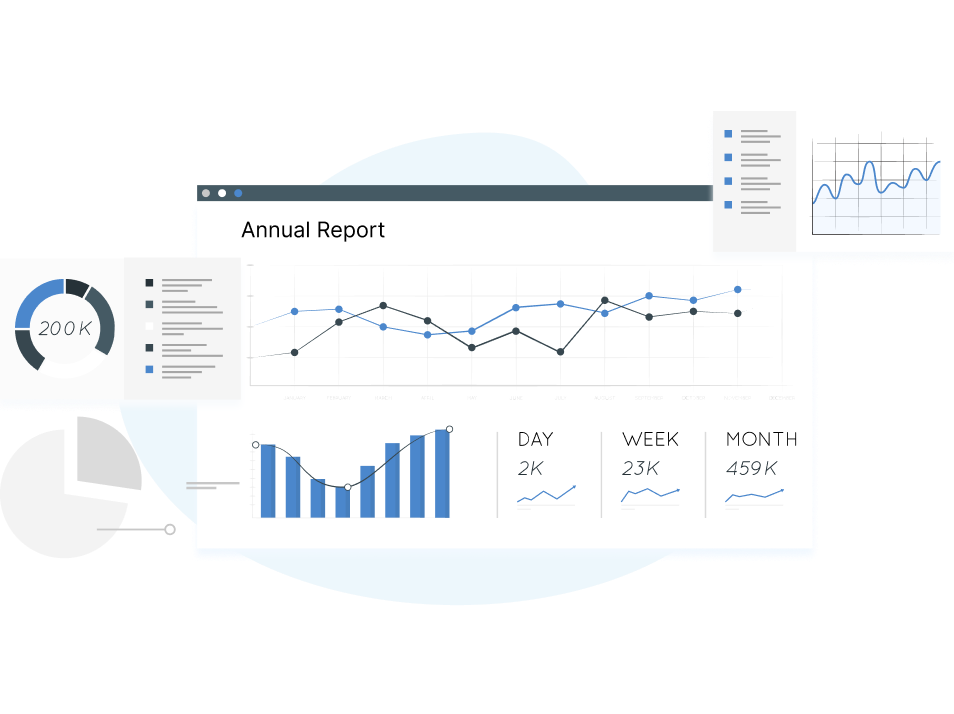
Data visualization software helps to represent data in an actionable way so that you can better understand and make important business decisions from the data.
Now with the help of such tools, you can create easy-to-navigate dashboards, craft annual reports and slide decks for investors, and visualize different metrics under one roof for all your GTM teams.
Many such solutions are often feature-rich and affordable, making them ideal for early-stage startups. One of them is Databox, which has versatile capabilities. In this post, we will compare it with its top five alternatives to Databox to help you choose one that meets your requirements in particular.
When it comes to data visualization tools, Databox is unquestionably a pioneer. It is a cloud-based business analytics tool for marketers, analysts and decision makers that measures various KPIs and assists in creating reports all using a single interface.
The tool makes data-driven decisions easier for you as it helps to visualize performance trends, connect your data in one place, and track your progress. In addition, it provides custom views and deep dives for each of your organization's functions.
Databox provides access to a wealth of Datasources like HubSpot, Google Analytics, Instagram, Stripe, Facebook Ads, Moz etc. to its users. Databox's REST APIs and SDKs allow users to import data from their own databases.
A great feature of the Databox app is its real-time access to company performance through scorecards, alerts, and weekly summaries. Its drag-and-drop functionality makes it possible to create custom dashboards to display various data sources.

Reviews indicate that Databox's Pixel Perfect reports are its best feature.
Databox offers a 15-day free trial of any paid plan.
Free: $0, includes up to 3 datasources, 3 Dashboards with 5 users and Daily Data Refresh
Starter: $72/month
Professional: $135/month
Performer: $231/ month
It's time to throw light on the top Databox alternatives available in the market.
Despite Databox's popularity as a data visualization tool, there are many Databox competitors/ alternatives on the market that you can compare and explore when choosing one.
Then let us tell you what else an alternative should have before we get into the specifics of each tool.
1. Simplicity of usage
The simplicity of use is key to any successful data visualization tool. There is no point in having a tool if your team is reluctant to use it because of its complex operation. So choose a tool that makes adaptability and usage easy for your team.
2. Versability of representing data
But the most important thing about data visualization is its versatility. You can use the same data in multiple ways depending on what you want to show or how you want to present it. So pick a tool that can generate charts, graphs, and KPI dashboards in different ways.
3. Pricing
No matter how cliche it sounds, pricing is an important decisive factor, especially for early-stage founders. So, if you’re looking for a Databox alternative, look for a tool with competitive pricing without compromising on the features or the quality.
4. Customer support
For any SaaS platform, customer support is key to retaining clients. According to HubSpot, 90% of Americans consider customer service when making a purchasing decision. So, the next time you think of picking a data visualization tool, pick one which has a responsive customer support system in place.
Dataflo is a data intelligence tool that consolidates data from applications across the tech stacks like CRM, Marketing analytics, Sales intelligence and presents this data in a neat, unified interface where users can dive straight into data analysis.
Dataflo has over 25 ready-to-use dashboards. All you need to do is plug your data sources into the dashboard, and you're good to go! Users can build dashboards in minutes to track metrics that matter most in a single pane. You can get instant Alerts, Daily Metric Report and Collaboration right from your slack.
You don’t have to depend on often messy, time-consuming spreadsheets to track the most important KPIs/ metrics.

Read More: Explore what all you can do with Dataflo

Connect your tech stack
Integrate your apps with Dataflo using SSO, OAuth or Basic
Select metrics or KPIs
Select the metrics or KPIs you want to track for your teams
Create Dashboards
Add the metrics you have selected into a dashboard
Collaborate in real-time
Leave annotations, comments, or share your dashboards with an external link
Below are some of the integrations of Dataflo

View all integrations supported by Dataflo.
Choosing Dataflo is a great idea for a number of reasons
1. Reason #1 - Marketing Attribution
You can identify which of your marketing channels your customers interacted with had the most impact in nudging them to make the purchase.
2. Reason #2 - Funnel Lead Analysis
Now you can track your leads, deals created or the number of visitors who turned into deals won for a given period through our Funnel Dashboard.
3. Reason #3 - Subscription Analytics
Take charge of your business's revenue health by getting all the data about MRR, ARR, ARPU, Churn, in one single place.
4. Reason #4 - No limitations on users or connectors
There’s no cap on the number of users so leverage the unlimited user licence to keep your teams engaged and make data driven decisions.
5. Reason #5 - Team collaboration
Always track your marketing performance and keep your team members informed about what is working and what is not. Track the progress of your team members by annotating, commenting, and tagging them and getting notified by email or Slack.
6. Reason #6 - Pricing
Dataflo offers the following pricing models:
Starter: Free includes up to 3 users + 3 datasources
Growth: $99 per/month with unlimited users + 10 datasources
Premium: $199 per/month with unlimited users + unlimited datasources
7. Reason #7 - Support
Dataflo has a strong support team and has tons of resources so users can find any answers they are looking for.
Klipfolio is a potent cloud-based BI tool that helps thousands of business owners to make data-driven decisions. It lets users connect to any data source and represent data in myriad ways as and when needed.
The tool helps to create dashboards, PDF reports, TV data boards, mobile monitoring, snapshot emails, and more. Some key features allow you to visualize data in a single click, along with data exploration and history.
Just enter your key metrics, and you'll be able to see them in one place—no coding required. It enables users to customize the settings to view data from any channel they want.
Related: Are you in the market for a Klipfolio alternative? Our post has you covered with a great alternative that can take your data analysis to the next level.

Below are the pricing models Klipfolio offers:
For the enterprise level, it has custom plans starting at $499/month.
Looker studio (Formerly Google Data Studio) a cloud-hosted application was introduced on March 15, 2016. Looker studio/ Google Data Studio lets you create intriguing visuals from raw data sets for free using their drag and drop editor.
Looker studio/Google Data Studio is a free data visualization and reporting tool that enables you to represent data in a meaningful way and make important business decisions. Moreover, users can share reports by customizing schedules and attaching previews as well as links to the entire report.
If you are looking for a free tool to create customizable and insightful reports – Looker studio/ Google Data Studio is a good alternative to consider.
Related: Seeking a Looker Studio alternative? Read on to discover a superior option that can transform your data analytics game for good.

Looker studio/ Google Data Studio is a free platform that's part of the Google Cloud offering.
HockeyStack is a data-driven SaaS analytics platform. It captures data from marketing, revenue, and product and analyzes them so the marketing team can identify the drivers of engagement and leads.
It has different features, including conversion tracking, single sign-on, audit log, access control, data import, etc. It also helps in customer journey mapping and streamlines the different processes like cross-domain tracking and user identification.
It also has a survey tool that you can use to conduct surveys and import the survey data into the analytics workflow.

HockeyStack offers two paid plans:
The plans have a 14-day trial with a 30-day money back guarantee.
Geckoboard is a powerful Data Visualization tool that helps you build real-time business dashboards in a matter of minutes without any coding or training. The tool can integrate with more than 80 different tools and services to extract and represent data in a slick-looking dashboard.
Users can make a dashboard available to be viewed at regular intervals, by having the screenshots of it sent via email or posted on Slack. It offers a wide range of viewing options, enabling you to share dashboards on TV screens or mobile devices.
Users can build their first dashboard for free for 14 days - no payment details required.
Related: Unhappy with Geckoboard? Explore our post where we delve into better Geckoboard alternatives that can provide more advanced features and capabilities with deeper insights and analytics.

Geckoboard has the following pricing options available.
A free 14-day trial is also available that includes all features.
By now you're aware of the different Databox alternatives available in the market. We also need to keep in mind that the scope of using data vizualization and dashboarding tools has increased over the years. More than just a handful of visual representations, these tools help us dissect the data and our findings in an understandable and convenient way.
If you’re a B2B SaaS company, you know that the data visualization tools on the market are primarily built for ecommerce, B2C, and agencies—not for your business in particular.Therefore, you might be on a hunt for a tool that is more specific to your needs.
Dataflo is different, it is meant specifically for B2B SaaS companies. It was built keeping in mind the challenges that come with managing data for a B2B SaaS business and offers the flexibility and scalability you need to grow your business.
Fast, easy and effective - these are just some of the words that describe Dataflo’s GTM dashboard. From ad creation to campaign optimization and reporting, we’ve got everything you need to get the most out of your data.
Check out dataflo if you are a B2B SaaS and looking to build a dashboard for free.

How Zenduty 2x'ed Efficiency WoW with Dataflo's Churn Analysis


Ira is a writer and blogs about her love of words. She has been responsible for creating powerful and effective content that attracts and retains customers. A blend of her humble writing experience and an endeavour to inspire people with her words is on her table now. She is an avid reader and a music lover too. She loves to devote time each day to yoga and meditation in addition to going for walks.