Join Dataflo @ SaaS Insider's India 2022 on May 26 - 27
Register Now
.
16
MIN READ

The Top 5 Klipfolio Alternatives in 2023

Searching for the best Klipfolio alternative? Explore these top data visualization tools that can provide greater insights into your business performance.
Ira Singh
Ira Singh
Oct 13, 2022
Klipfolio alternatives

Table of Contents

Show table of contents
Hide table of contents

"We're entering a new world in which data may be more important than software" - Tim O'Reilly. - Founder of O'Reilly Media

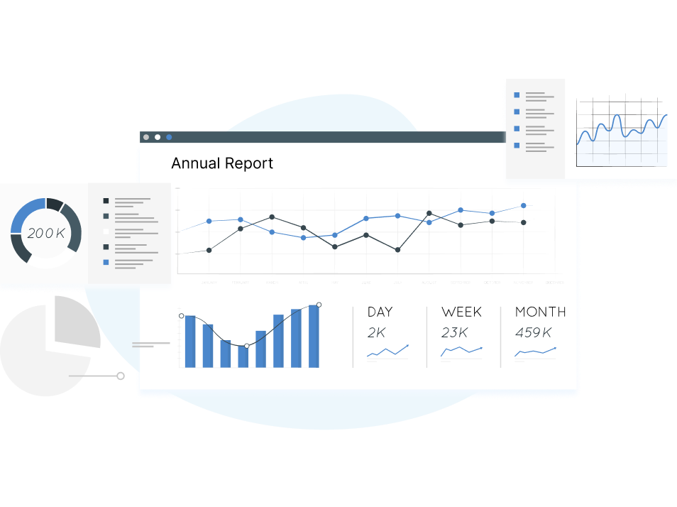
Data is the new software, and data visualization tools are the next frontier. With the amount of data increasing exponentially, the importance of interpreting that data is growing as well and the best way to do that is through data visualization tools. 

According to a study at MIT., “90% of the information transmitted to the brain is visual.”

When you combine the power of visuals with data analysis tools, you can create meaningful visualizations that make sense out of seemingly-unrelatable numbers or statistics. 

Looking at your business through the lens of data, you realize there are all sorts of opportunities for improvement that you couldn't see before.

Interestingly, there are plenty of tools out there to help you get started with data visualization.

You have to find the right tool that works best for you. Klipfolio is one such great option if you're looking for a tool that lets you create beautiful data visualizations in no time. In this post, we will compare the top 5 Klipfolio alternatives to see how well it stacks up against its competitors.

Related: Our guide will help you determine which alternative to Databox is best for your needs if you’re looking for one.

All your metrics inside your slack

Using Slash command in Slack, track your key metrics for a given period in just 3 clicks.

Klipfolio Overview

Klipfolio is an innovative data visualization tool that helps thousands of organizations bring their data to life with its powerful cloud-based business dashboard solution. Users can connect from virtually any data source and quickly create stunning customizable dashboards, reports, and charts. Here's the best part: You get all the power of advanced data visualization in a drag and drop interface.

Klipfolio empowers product and marketing teams with insights that engage and inform users about critical business metrics. Creating dashboards with Klipfolio is a breeze given its library of pre-made templates.

Klipfolio Dashboard

Source: trustradius

  • Report sharing and collaboration
  • Customizable dashboards
  • Data discovery
  • Multi-User Support (named login)
  • Location Analytics / Geographic Visualization 

Integrations of Klipfolio

  • Twitter
  • Gmail
  • Slack
  • Mailchimp
  • Freshdesk
  • Google Sheets
  • Airtable and more

Pros

  • An easy-to-use user interfaceI makes visualization and set up easy
  • It's flexible, allowing you to create custom charts based on a variety of data sources
  • The return on investment is good and it is cost-effective
  • You can create multiple graphs from different data sets in a single Klip
  • A very responsive and helpful support team is available at Klipfolio

Cons

  • Custom date filters on dashboards are slow and take time to load
  • Someone with no coding or large dataset experience may find it challenging to build the backend of the dashboard
  • Klipfolio has some size limitations on .csv files, which can be annoying for users
  • Setup can be tricky for some features and functions.

Pricing

Klipfolio offers three pricing models and a free trial too:

  • Plus: $99/month 
  • Pro: $229/month
  • They also have Custom Pricing

For the enterprise level, it has custom plans starting at $499/month.

What should you consider when choosing a Klipfolio Alternative?

  1. Ease of Use- When you're choosing a data visualization tool, it's important to consider the simplicity of use. A user-friendly interface will make your life easier, and you'll be able to get more done in less time.
  1. Versatility- You want a tool that will allow you to present your information in a variety of different ways so that you can show it to different audiences in different contexts. A good way to do this is by looking at the types of tools it offers.
  1. Pricing- Pricing is an important consideration for early-stage startups. Therefore, if you're in the market for a business intelligence tool that's comparable to Klipfolio but has more affordable plans—without sacrificing functionality or quality then you can consider it.
  1. Customer Service- One of the most important things to consider when choosing a data visualization tool is how much support you'll receive from the tool's creators when you face a problem. Select the one that has excellent customer assistance.

Let's now look at Klipfolio competitors

1.

Dataflo

Dataflo is a potent data visualization tool for SaaS businesses to visualize their GTM metrics across different datasources. It translates data from applications across tech stacks like CRM, Marketing analytics, Sales intelligence into a neat, unified interface so users can dive right into data analysis.

With Dataflo’s versatile features, staying on top of your mission-critical KPIs/ metrics is simpler than ever. Say goodbye to creating reports on spreadsheets.

Dataflo has a dashboard for every need. You just need to plug in your data sources and you're ready to go! Users can create dashboards in minutes and track metrics they care about most. You can receive instant alerts, daily metric reports and collaboration notifications from within Slack

Dataflo boasts a user-friendly interface that makes it stand out from competition.

Dataflo Dashboard

Popular Features:

  • Customized Dashboards
  • Team Collaboration
  • Alerts and Notifications
  • Real time insights

Integrations of Dataflo-

The following are some of the integrations available in Dataflo.

  • Salesforce
  • Google Analytics 4
  • Chargebee
  • Hubspot Marketing
  • Twitter
  • Mailchimp
  • Pipedrive
  • Zoho CRM
  • Google Ads

Benefits of Choosing Dataflo

  1. Marketing Attribution- You can discover which marketing channels are most effective in influencing customers to make a purchase
  1. Funnel Lead Analysis- The funnel dashboard lets you track leads, deals created, and visitors who converted into deals for a given time period.
  1.  Subscription Analytics- Manage your business's revenue health with comprehensive data on MRR, ARR, ARPU, and churn.
  1. Unlimited users and connectors- There is no limit on the number of users, so you can engage entire teams and make data-driven decisions.
  1. Collaborate with Context- Keep track of your marketing's performance and communicate it to the people who matter. Tag, annotate, comment on work—get notified by email or Slack and watch everyone grow!

Pricing

Dataflo offers the following pricing plans:

Starter: Free includes up to 3 users + 3 datasources

Growth: $99 per/month with unlimited users + 10 datasources

Premium: $199 per/month with unlimited users + unlimited datasources

2.

Databox

Databox is a business analytics tool that helps you make sense of your data. You can use it to analyze your current business performance, identify trends and patterns, and make data-driven decisions.

It's a web-based platform with an easy-to-use interface that allows you to get the information you need quickly. Databox also has the ability to connect with Google Analytics and other tools so you can pull in real-time data from those sources as well.

The Databox app gives you real-time access to company performance by providing daily score cards, alerts, and weekly summaries. And if you need to create custom dashboards for different Data Sources, the app's drag-and-drop functionality will make it a snap.

Databox Dashboard

Source: Trever.io

Popular Features

  • Customizable dashboards
  • Report sharing and collaboration
  • Formatting capabilities 
  • Report Formatting Templates
  • Data Discovery and Visualization

Integrations of Databox:

  • Slack
  • PayPal
  • Mailchimp
  • Google Sheets
  • Hubspot marketing hub 
  • Google Analytics 360
  • Instagram

Pros

  • Dashboards with a high degree of customization
  • Mobile friendly dashboards- Easily access business insights on tablets, smartphones, and wearables
  • The white-labeling feature lets you build reports and dashboards with your company's branding - logos, colors, etc.
  • Integration of tools across a wide spectrum

Cons

  • It is not as user-friendly, and it lacks flexibility
  • Many of the pre built templates are quite similar to each other
  • There should be more ways to direct integrations
  • It is not always possible to get super accurate or up-to-date data.

Pricing

All paid plans offered by Databox come with a 15-day free trial.

Free includes up to 3 datasources, 3 Dashboards with 5 users and Daily Data Refresh

Starter: $72/month

Professional: $135/month

Performer: $231/ month

3.

DashThis

DashThis is a cloud-based marketing reporting dashboard solution that allows users to create custom dashboards for all of their digital marketing campaigns.

Users can integrate multiple data sources in any combination to display all of their key marketing data into a single, automatically-updating report, which can be emailed to stakeholders automatically.

DashThis lets you create customizable dashboards with preset widgets and pre-built templates. You can also create your own custom widgets, add logos, headers and notes, and customize your dashboard to fit the needs of your business.

Dashthis Dashboard

Source: G2

Popular Features

  • Data Visualization
  • Customized dashboards
  • Reporting/Analytics
  • Data Import/Export
  • Visual Analytics

Integrations of DashThis

  • Mailchimp
  • Google Analytics 360
  • Instagram
  • Semrush
  • LinkedIn
  • Twitter
  • Google Ads

Pros

  • The tool is fairly user-friendly and has a lot of reporting capabilities
  • The customer service is excellent
  • The tool offers enhanced flexibility and functionality, as well as provides analytics beyond just the website.
  • Integrates with multiple tools or platforms

Cons

  • The interface is somewhat limited, and still there are some glitches (bugs)
  • DashThis may not be a cost-effective alternative
  • The number of widgets per dashboard is limited
  • It’s difficult to change data sources without submitting a contact form.

Pricing

DashThis offers the following pricing models:

  • Individual: $45
  • Professional: $139
  • Business: $269
  • Standard: $419

It offers a 15 days free trail also.

4.

Whatagraph

Whatagraph provides cross-channel reporting and analytics for measuring the performance of the marketing departments across different teams.

Users can use Whatagraph to create charts, maps, and infographics that display their data in an engaging way. It can be used to create dashboards, generate reports and even build interactive visualizations. The tool enables users to create reports from multiple sources, automate the marketing data and collaborate on reports that can be branded with company logos and colors.

Whatagraph Dashboard

Source: G2

Popular Features

  • Data Visualization
  • Reporting/Analytics
  • Data Import/Export
  • Reporting & Statistics
  • Dashboard

Integrations of Whatagraph

  • AdRoll
  • Campaign Monitor 
  • Google Analytics 
  • Mailchimp, and more

Pricing

Whatagraph comes with the following pricing plans: 

Pros

  • It's easy to use—the UI is simple and intuitive so you don't need any special training or knowledge of coding to get started
  • The staff at Whatagraph is very responsive when it comes to questions or concerns about the product or service
  • This is useful for companies that need to track multiple social media accounts and ad streams for their various client groups
  • Then visual output

Cons

  • The new interface retains all features, but suffers from frequent authentication and user interface glitches
  • Inflexibility to change the payment options.
  • The tool can be glitchy, and the reports aren't visually appealing
  • It’s a bit pricy in comparison to the competition

5.

Agency Analytics

Agency Analytics is a data visualization tool used by agencies to create digital marketing campaigns. 

Users can build custom dashboards to get a complete picture of thier clients’ campaigns, with the ability to drag-and-drop widgets and offer information on Google and Bing rankings, social media engagement, backlinks and linking domains etc. 

It offers PPC keyword tracking, SEO auditing, backlink monitoring, social analytics and automated reporting to the marketing agencies.

AgencyAnalytics Dashboard

Source: Get App

Product Features

  • Data Visualization
  • Reporting/Analytics
  • Data Import/Export
  • Visual Analytics
  • Reporting & Statistics
  • Dashboard

Integrations of AgencyAnalytics

  • Mailchimp
  • Google Analytics 360
  • Instagram
  • Hubspot CRM
  • ActiveCampaign
  • Shopify and more

Pros

  • The user interface and Setup is very easy and straightforward
  • Their customer service is very efficient and responsive
  • The tool is very transparent and affordable despite being packed with features
  • Very feature rich in terms of integrations

Cons

  • Some of the dashboards are slow and take time to load
  • There is room to add more integrations.
  • No reports are available
  • There are some actions that cannot be executed on all integrations

Pricing

Agency Analytics offer flexible pricing options that are as follows:

Freelancer: $12/month

Agency: $18/month

Enterprise: Custom Pricing

They offer a 14 days trial period as well

Data driven decisions

As you can see from this brief overview, there are many data visualization tools, each with its own unique features and capabilities. There are no one-size-fits-all tools.

They all have their pros and cons. So, it ultimately comes down to the specifics of your situation and which tool best fits your needs. There a lot of factors involved in deciding on a data visualization tool. But just like with any choice (enterprise tools, software, phones), once you stand back and weigh the options, the best decision will likely become pretty clear.

If you're a B2B SaaS company, your business is unlikely to benefit from data visualization tools designed primarily for ecommerce, B2C, and agencies. Dataflo is geared towards B2B SaaS companies and particularly addresses the challenges associated with managing data in B2B SaaS businesses.

Check out Dataflo if you're a B2B SaaS company and looking to build your own dashboard.

Build your Free Dashboard today
Get a 360 degree view of your business performance with GA4 Dashboard today
Measure user engagement on your website with Dataflo's Favourite Dashboard

Dataflo, a simple no code platform to visualise all your paid campaign metrics

Wouldn't it be nice to have a single dashboard that summarizes all your marketing efforts in one place? Check out Dataflo’s pre-built customizable dashboard for monitoring and evaluating the success of your paid marketing efforts across all your ad campaigns.

What if you get common values for Impressions, Clicks, CTR, CPC etc. for your multiple ad campaigns all under one roof?

Dataflo simplifies your paid advertising reporting with this feature. You don’t have to depend on often messy, time-consuming spreadsheets to track the most important KPIs/ metrics. No more logging into multiple accounts or hopping between different tools in the tech stack to check how your accounts on different channels are performing, or compiling a comprehensive report that seems to take eternity.

Now you can view your Facebook, Twitter and other social media performance metrics in one place.

Get started by following these 3 simple steps:

Step 1: Get our pre-built template

Step 2: Connect and integrate your PPC accounts with Dataflo

Step 3: In seconds, your dashboard will be ready to use

All your metrics inside your slack

Using Slash command in Slack, track your key metrics for a given period in just 3 clicks.

Are you a paid marketer running campaigns across multiple channels?

Identify the top-performing campaigns across multiple channels that generate revenue and conversions with Paid Revenue Attribution Template

Get Started
Ira Singh
author

Ira Singh

https://www.linkedin.com/in/irasingh3

Ira is a writer and blogs about her love of words. She has been responsible for creating powerful and effective content that attracts and retains customers. A blend of her humble writing experience and an endeavour to inspire people with her words is on her table now. She is an avid reader and a music lover too. She loves to devote time each day to yoga and meditation in addition to going for walks.

Get your metric right inside your slack workspace.
Frequently Asked Questions
Your subscription could not be saved. Please try again.
Your subscription has been successful.
Subscribe to our Newsletter
Ira Singh
author

Ira Singh

https://www.linkedin.com/in/irasingh3

Ira is a writer and blogs about her love of words. She has been responsible for creating powerful and effective content that attracts and retains customers. A blend of her humble writing experience and an endeavour to inspire people with her words is on her table now. She is an avid reader and a music lover too. She loves to devote time each day to yoga and meditation in addition to going for walks.

Get your metric right inside your slack workspace.