Join Dataflo @ SaaS Insider's India 2022 on May 26 - 27
Register Now


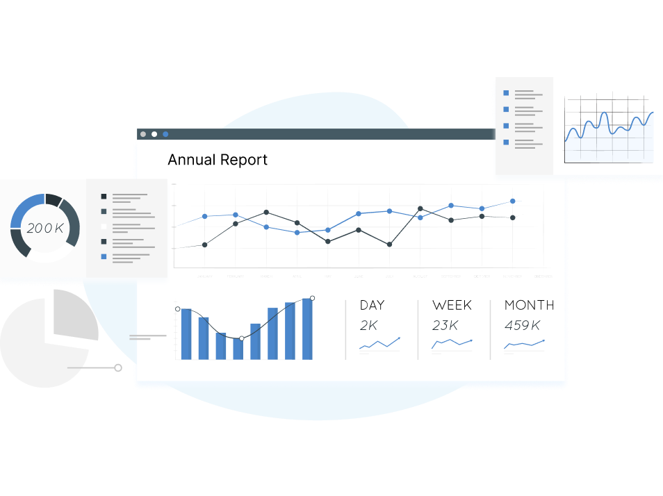
Thanks to Google Sheets and it's all-powerful, customizable dashboards, data analysis has never been easier.
Just take a look at how to create a dashboard in Google Sheets for marketers

In a single view, you can see all the relevant numbers in your marketing funnel - your site traffic, which channels bring the most users, how your week-on-week growth is etc.
Rather than sit and pour over hundreds of rows of numbers, dashboards help you cut through the noise and lead you straight to actionable insights in no-time.
Best part?
You can create such powerful Google Sheets Dashboards tailored specifically to your team’s goals, focusing only on the metrics you want.
Before knowing how to create a dashboard in Google Sheets, you have to ask a few questions which will pave the way for setting up the right kind of dashboard giving you the insights you want.
When it comes to data analysis, the first step is to get a clear picture on the end user.
This is crucial because even within the same team, the metrics you’ll want to measure differs from role to role - for instance, a content writer might be focused on the numbers around blogs, while a campaign specialist will be keen on the email outreach numbers.
In contrast, the marketing head or the CEO will want a holistic overview of the entire marketing funnel.
So before you even open your Google Sheets to create your dashboard, the first question to ask is, who are you creating it for.
The next key aspect is understanding is why you are creating this dashboard.
Or more specifically, what is the single most important objective you want to get out of this dashboard?
It could be to:
Once you’ve set a goal, the next step is to identify the key, relevant metrics which will help you gauge how you stand with respect to your single goal.
You could even be more specific by quantifying it - “What are the 5 metrics that I am going to measure?” It could even be 3 or even 7 - it doesn’t matter.
The idea is to narrow down and focus only on the right metrics instead of running after vanity metrics in random fashion, which is a colossal waste of your time and resources.
It could be:
The last piece of the puzzle is, listing down the tools you would integrate with Google Sheets to pull up the data you need for your analysis.
For example, to track the above metrics you’d need to export data from Google Analytics. For other advanced or rather very specific metrics, like, say, your newsletter open rates, you might need an email marketing tool like Mailchimp to pull in the information you need.
But for most use-cases, a Google Analytics account and Google Sheets should be more than sufficient.
Now that we’ve discussed all the questions we need to, let’s jump into building our dashboard.
To create an automated Google Sheets Dashboard, the first step is to integrate Google Analytics with your website, so you can start tracking the key website metrics.
Set up Google Analytics on your website already? Jump straight to Step #2 .
To do this, you need to install a code snippet from Google Analytics to your website (No developer help required!)

In this page, the tracking snippet can be found under Global Site Tag which you will copy + paste to your website (every page you want to track).
To copy and paste your gtag.js, follow these steps:
Once you paste this code under the <head> Tag on each page of your site, you will be able to track your website metrics in Google Analytics.
If you have correctly installed the tracking code snippet in your website, your Google Analytics account should look something like this:

To get the relevant data into your dashboard, you need to integrate your Google Analytics account to Google Sheets - luckily, Google has the work cut out with an amazing Google Analytics plugin that you can find on the GSuite Marketplace.
To install the plugin, in Google Sheets, click on Add-Ons -> Get Add-ons.
This will take you to the G Suite Marketplace where you can install the Google Analytics add-on.

Before jumping into building dashboards, outline the specific metrics you want to track. For this guide, we’ll recreate the sample dashboard from the introduction of this post:
As you can see, it contains four important marketing metrics:
Prefer watching a video tutorial instead instead of reading the blog? Here you go.
To get the website metrics (available in your Google Analytics), to your Google Sheets Dashboard, go to Add-ons -> Google Sheets -> Create a New Report
This is the function you’ll keep returning to whenever you want to add any new website metrics to the dashboard.


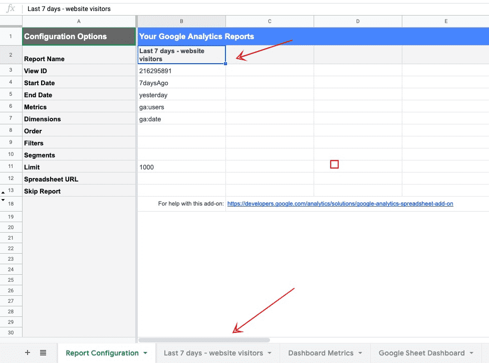
The first step is to give a name to our report.
Next, we’ll choose the account from which we want to pull the metrics.
Here, we are going with a personal account created just for this tutorial.
Finally, let’s select the metrics we want to run a report for - since we are looking at last 7 days website visitors, let us select users as our metrics and date as our dimension.
Note: In Google Analytics, website visitors are called Users.
This returns the data for the number of users who have visited our website in the last 7 days ( By default, Google Analytics selects the time period as ‘Last 7 days’. We will later explain how you can change this.


As you can see, once the report is successfully created, the Google Analytics add-on automatically creates a new sheet with the same name as our report, containing relevant data based on the metrics and dimensions we chose.
Click on the new sheet to view the metrics.

The report has returned with values of users who visited the website in the last 7 days - July 27 to August 2.
Now that we have our first set of data from Google Analytics, the next step is to transform that into a graphical chart for the dashboard.
To do that, let us first create two separate sheets:

The reason we do this is, everytime we run a report, a new sheet gets created automatically - to create our dashboard, we need to consolidate the data from all these sheets into one master sheet - we’ll call that ‘Dashboard Metrics’ (which will contain only the raw data from the other sheets) and another sheet called ‘Google Sheet Dashboard’ where we will have only the charts, making it easy for us to read and analyze the data.
To avoid confusion, let’s change the name of our first report from ‘Google Sheets Dashboard’ to something more specific - we’ll call it the Last 7 days - website visitors since that is the metric available in the sheet.
When changing the name, make sure to change it in the Report Name cell in the Report Configuration sheet as well as the sheet’s name at the bottom.
Now that we’ve clearly defined which sheet is for what purpose, let us head over to Dashboard Metrics to create our first chart - Last 7 days website visitors.
Here’s a step-by-step guide to convert the raw data into a chart.
Step 1: Create two new columns in the sheet called Date and Users
Step 2: In the cell right below the Date, enter ‘=’ ( this allows us to get the data from other sheets)

Step 3: Head over to the Last 7 days - website visitors sheet and select the first cell below the data column. At this point, we’re basically referencing this cell value to our dashboard metrics sheet.

Select the cell and press enter. This will take you back to the dashboard metrics sheet and the same cell value gets copied there.
If you’ve done this correctly, this is how your sheet will look like:

Step 5: To get all the dates, simply click on the cell and drag it down.

Step 6: Follow the same method to get the users count to the corresponding dates.
Now that we have the data we need, let’s turn it into a chart:
Select the two columns, click on Insert -> Chart
Our chart for the first metric in our dashboard is ready!

It is important to understand how much time the visitors spend on your website so you can improve its content accordingly.
Since you have already created your first report, there are two ways to create the subsequent reports in Google Sheets.
You can simply follow the same steps, i.e go to Add-ons -> Google Sheets -> Create a New Report

Alternatively, you can simply copy the details from the first report, changing only the metrics and dimensions value, since the other data like View ID, Start Date, End Date will remain the same for every metric.

Since we are looking for the numbers for session duration, let’s replace ga:users to ga:avgSessionDuration and run the report.
Just like the first report, you will see a new sheet added at the bottom, containing the numbers for the average session duration for your website visitors in the last 7 days.
Average session duration is a metric that measures the average length of sessions on a website.
You can create a chart by following the same steps as you did previously.

Identifying from which channels the visitors land on your site is an important measure of your outreach efforts - this will help you understand which channels work the best, where to focus your efforts and so on.
To get the data we need, let’s create a new report like usual:
But unlike the previous reports where we compared users (Metric #1) and Avg. Session Duration (Metric #2) where Date was the dimension, here we are comparing Users with the respective Traffic Sources.
That means, our metric will be users and the dimension will be Source.
You can change the dimension from Traffic Sources -> Source

After creating the report, add the new numbers to the dashboard metrics sheet and create a chart.

We’ve already created a Last 7 days Visitors report - but if you want to go one level deeper and get more granular data, this is a useful metric which measures how many visitors come to your site week after week.
A This Week vs. Last Week comparison chart reflects how your efforts as a team in the last week translated into website visitors.
This way you can look at this data and put a finger on your activities from the previous week that would have contributed to the number - whether it is a new blog, lead magnet, or a new landing page; discarding the ones that didn’t work or doubling down on what worked really well.
However, this metric is slightly tricky to bring into our dashboard and will require the use of creating two different reports and the use of Google Sheet functions.
If you prefer video, here is a tutorial where we walk through how to get this data in Google Sheets dashboard:
Before we begin, for the report to make sense, you need to define a 7-day window with the start and end date - this is the data that gets updated week after week.
For our convenience, let us use the standard 7-day period - Monday to Sunday so you can easily track back to your marketing efforts in the previous week.
To summarize, here are the 2 reports we will be creating:
This Week Report:-
Start Date - Current week’s Monday
End Date - Current date (Today’s date)
Last Week Report:-
Start Date - Previous week’s Monday
End Date - Previous week’s Sunday
This Week Report

The function for the start date is the tricky part - since you want the report to always start with Monday and end on a Sunday irrespective of which day you create the report.
Here’s the function to enter in the start date cell.
=today()-weekday(today())+2
Looks complex?
We’ll break it down the different components in the function:
=today()
The today function returns the current day of the week.
Eg. Wednesday, Saturday; whichever day you are creating the report.
But that is not the date we are after - we want to know what date Monday falls on in the current week, since that is the start date for our report.
To find this, we’ll use Google Sheets’ weekday function that returns the value for what weekday the current date is.
= weekday(today())
Example. 5 means Thursday, 4 means Wednesday and so on.
In the same function, adding a +1 at the end returns the date of the Sunday in the week.
= weekday(today())+1)
The above function is useful if our week was from ‘Sunday’ to ‘Saturday’.
Since our week is Monday to Sunday we’ll add a +2 at the end:
(= weekday(today())+2)
Additional read: Here’s an article that explains how the weekday function works in Google Sheets.
So the function for our start date is ( = weekday(today())+2)returning the date of the Monday in the week.
This is straightforward because while your report starts on Monday, it should always end on the current day.
If you are wondering why so, once you have created this report, - you are looking for the numbers from the start of the week (Monday) to whatever is the current day you are reading the report.
Function:
Start Date: = weekday(today())+2)
End date: = today
This is how the report will look like:

Since we’ve created this report on a Tuesday, it returns the numbers for only Monday (08/03) and Tuesday (08/04).
If we come back to this report later this week, the remaining dates will have been updated here.
Last Week Report
Since we’ve already defined the function for the current week, we can simply use that as a base value to get the numbers for the week before - so the start date is simply the previous Monday, which is 7 days before This Week report’s Start Date.
Start Date: =E4-7
End Date: = E4 - 1 (Last week’s End Date is simply one day before the current week’s Start Date)

Now that we have our reports, let’s turn it into a This Week vs. Last Week chart.
In our Dashboard metrics sheet, add 3 new columns:
Day | This Week | Last Week

Fill up the Days column - from Monday to Sunday.
For the other two metrics, fill in the data from the two latest metrics and create a chart.

Our chart is ready!
With our Google Sheets Dashboard created, there are a couple of improvements we can make to make it easy for us to read and analyze the data.
When you first create a new chart, Google Sheets by default creates them in the same sheet where you have your metrics.
Since we want a neat dashboard, simply move the charts to a separate sheet (Google Dashboard Sheet) which we’ve already created.

When creating a new report, the Google Analytics add-on will create a series of new sheets at the bottom, making your sheet congested and a little difficult to read through.
To avoid this, let’s hide all sheets except our primary Report Configuration, Dashboard metric, and Google Sheet Dashboard sheets.
You can do this by right clicking the sheets at the bottom and clicking on Hide Sheets.
To view these sheets, go to View -> Hidden Sheets at the top.
Finally, to create an automated dashboard, we need to schedule reports at a regular interval.
To do this, head over to Add-ons -> Google Analytics -> Schedule Reports

After saving, the reports will get updated every day in the same window - you can even customize it to every week or even every hour!
An automated Google Sheets Dashboard is one of the best ways to get a complete overview of your marketing funnel and understand how your team’s efforts are translating into results.
To make this dashboard even more useful, you can add other metrics such as Traffic by country, Number of signups, etc. that answers important questions like product market fit, buyer persona, best performing channel etc.
If you are looking for an affordable and efficient solution, we are currently building Dataflo, a sleek and powerful data exporter for applications across the tech stack.


Krishna is dedicated to helping brands and startups grow through user-centric product design that helps them get the most out of their data. He acts as a conduit, understanding what customers need and then creating products that meet those needs. He is a nature enthusiast and has fondness for great music and movies.