Join Dataflo @ SaaS Insider's India 2022 on May 26 - 27
Register Now


In today's data-driven world, effective data visualization is crucial for Saas companies and marketers alike to make informed decisions and gain valuable insights.
As the demand for data visualization tools continues to grow, many platforms have emerged to cater to varying needs and preferences.
Among the many options available, Databox and Hockeystack have gained significant popularity as powerful data visualization platforms.
Databox and Hockeystack offer intuitive interfaces and comprehensive features to transform complex datasets into visually appealing and easily understandable representations.
While both platforms share a common goal of enhancing data visualization capabilities, their approach, functionalities, and strengths differ.
This article will explore and compare Databox and Hockeystack to help you determine which platform better suits your specific data visualization needs. Before that let’s have a quick look at what a data visualization tool is and how to choose the right tool for data visualization.
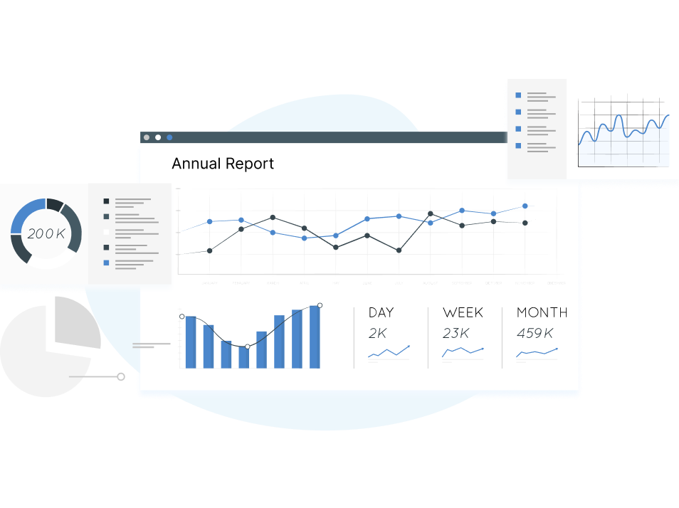
A data visualization tool is a software application or platform that allows users to present and analyze data in visual formats such as charts, graphs, maps, and interactive dashboards. These tools enable users to transform complex datasets into visual representations that are easier to understand, interpret, and communicate.
The primary goal of data visualization is to uncover patterns, relationships, and insights hidden within the data, making it more accessible and actionable. By visually representing data, these tools help users identify trends, outliers, and correlations, enabling them to make data-driven decisions and communicate information effectively.
Related: Looking for a Data visualization tool? Discover the top 8 marketing data visualization tools that empower marketers to transform complex data into stunning visual insights.
When searching for a data visualization tool, it is important to consider several key factors to ensure that it meets your specific needs and enables you to derive valuable insights from your data. Here are some aspects to look for in a data visualization tool:

A user-friendly interface is crucial, especially if you are new to data visualization. So, you must look for tools that offer an intuitive and easy-to-navigate interface with drag-and-drop functionality and pre-built templates or wizards that simplify creating visualizations.
Consider the variety of chart and graph types offered by the tool. Different data sets require different visual representations, so the tool you choose should provide a broad range of chart types, such as bar charts, line graphs, scatter plots, and maps, which helps you visualize your data in the most suitable format.
Customizing visual elements is essential for creating visually appealing and impactful visualizations. So, we recommend opting for a tool that offers options to modify colors, fonts, labels, and other design aspects to match your brand or personal preferences. Adding annotations, captions, and additional information to your visualizations can also be valuable.
Consider the tool's ability to connect and integrate with various data sources. It should support popular file formats, databases, cloud storage platforms, and APIs to ensure seamless data import and real-time updates. It allows you to work with live data and maintain up-to-date visualizations without manual effort.
Interactive features enhance the user experience and enable deeper exploration of data. Look for tools that provide interactive elements like zooming, filtering, and drill-down capabilities. The ability to interact with the visualizations and manipulate parameters on the fly can help uncover hidden patterns and insights.
If you plan to share your visualizations with your team members, check out whether the tool you choose can do it securely and flexibly. Additionally, consider features like the ability to embed visualizations in presentations, websites, or other applications, as they can greatly enhance your sharing capabilities.
Consider the tool's performance and scalability, especially if you work with large datasets or need real-time updates. Ensure the tool can handle the volume of data you are working with and provides efficient rendering and response times even with complex visualizations.
Some tools offer free or open-source versions, while others require a subscription or licensing fee. Evaluate the pricing plans, features included in each plan, and any additional costs for add-ons or premium functionalities to ensure they fit your budget.
By considering these factors, you can select a data visualization tool that aligns with your specific requirements, allowing you to effectively explore and communicate insights from your data to suit your needs and preferences.

Trusted by over 20,000 businesses, Databox is preferred for data-driven insights and efficient performance tracking. It is an analytics tool that enables users to connect and track their data from any tool, all accessible from any device. With Databox, users can streamline their data analysis process by consolidating information from multiple sources, eliminating the need for using multiple tools to understand their website's performance.
Drag-and-Drop Dashboard Builder: Databox provides an intuitive interface allowing users to build customizable dashboards by dragging and dropping visual components easily.
Data Integration: It integrates over 70 popular data sources, including Google Analytics, Salesforce, Facebook Ads, HubSpot, and more. It enables users to connect and sync their data seamlessly.
Pre-built Templates and KPI Library: Databox provides pre-built templates and a KPI (Key Performance Indicator) library, making it easier for users to get started quickly and track essential metrics without starting from scratch.
Alerting and Notifications: Users can set up custom alerts and notifications to stay informed about significant changes or anomalies in their data. It helps in proactive monitoring and decision-making.
Mobile Apps: Databox offers mobile apps for iOS and Android devices, allowing users to access their dashboards and visualizations on the go.
Integrations
These integrations enable users to pull data from various sources into Databox for comprehensive data analysis and visualization.
Pros of Databox
Cons of Databox
Pricing
Databox provides a 15-day complimentary trial for any of its premium plans. Their Free plan, costing nothing, supports up to 3 data sources, 3 dashboards, 5 users, and daily data refreshes.
For expanded features, you may opt for their paid subscriptions:
Related: Are you in search of alternatives to Databox? Explore our curated list of the top five data analytics solutions, designed to empower your business decision-making process.

HockeyStack is an innovative SaaS analytics platform that combines marketing, revenue, and product data. By integrating these key data sources, HockeyStack empowers marketing and growth teams to comprehensively understand the factors driving product engagement and generating high-quality leads.
With this valuable insight, businesses can accelerate their revenue growth and achieve success at a faster pace.
Heatmaps and Click Analytics: HockeyStack provides visual heatmaps and click analytics, allowing users to understand how visitors interact with their website. It helps identify popular areas, user engagement patterns, and areas of improvement.
Session Recordings: Users can record and replay user sessions to gain deeper insights into visitor behavior. This feature enables the analysis of user journeys, identifying pain points, and improving the overall user experience.
Conversion Funnels: It allows users to create conversion funnels to track and analyze the user journey from landing page to conversion. It helps identify bottlenecks, drop-off points, and areas where optimization is needed.
Form Analytics: With form analytics, users can analyze form submissions and identify areas for improvement. It includes tracking form abandonment, field completion rates, and user behavior within forms.
Real-time Analytics: HockeyStack provides real-time analytics, allowing users to monitor website activity, traffic sources, and conversions as they happen. This enables users to make data-driven decisions in real time.
Integrations
Pros of HockeyStack
Cons of HockeyStack
Pricing
HockeyStack offers two paid plans:
The plans have a 14-day trial with a 30-day money back guarantee.

Dataflo is a data visualization tool that consolidates data from various tech stacks applications like CRM, marketing analytics, and sales intelligence. It offers ready-to-use dashboards, quick data source integration, instant alerts, and collaboration via Slack.
With Dataflo, users can easily track important metrics without relying on spreadsheets. It is one of the best Databox alternative options.
Custom Dashboard: Easily monitor all essential metrics on a single, customizable dashboard.
Goal Monitoring: Track internal goals and measure progress against key performance indicators (KPIs).
Slack Integration: Automate and schedule reports, view important metrics and collaborate seamlessly using simple commands in Slack.
Collaboration: Enhance communication by tagging users and maintaining context within the application using the collaboration feature.
Subscription Dashboard: Gain insights into revenue sources, reduce churn, and improve customer retention efficiently using the subscription dashboard feature.
Integrations
Pros of Dataflo
Cons of Dataflo
Pricing
Dataflo offers a range of pricing plans to suit different needs. The starter plan is available completely free of charge, while the growth plan is priced at $99. Users can opt for the premium plan for more advanced features and capabilities, which is available at $199.

Determining the most suitable data visualization tool for your business depends on your needs, preferences, and budget. Each tool mentioned - Databox, HockeyStack, and Dataflo - offers unique features and capabilities. Here are some considerations to help you make a decision:
To determine the best fit, evaluate each tool against your business needs, and consider factors such as pricing, data source compatibility, ease of use, available features, and customer support.
Requesting demos and trial periods or contacting their respective sales teams for more information is also recommended. If you are interested in exploring Dataflo. Book a demo with Dataflo today!


Ira is a writer and blogs about her love of words. She has been responsible for creating powerful and effective content that attracts and retains customers. A blend of her humble writing experience and an endeavour to inspire people with her words is on her table now. She is an avid reader and a music lover too. She loves to devote time each day to yoga and meditation in addition to going for walks.