Join Dataflo @ SaaS Insider's India 2022 on May 26 - 27
Register Now


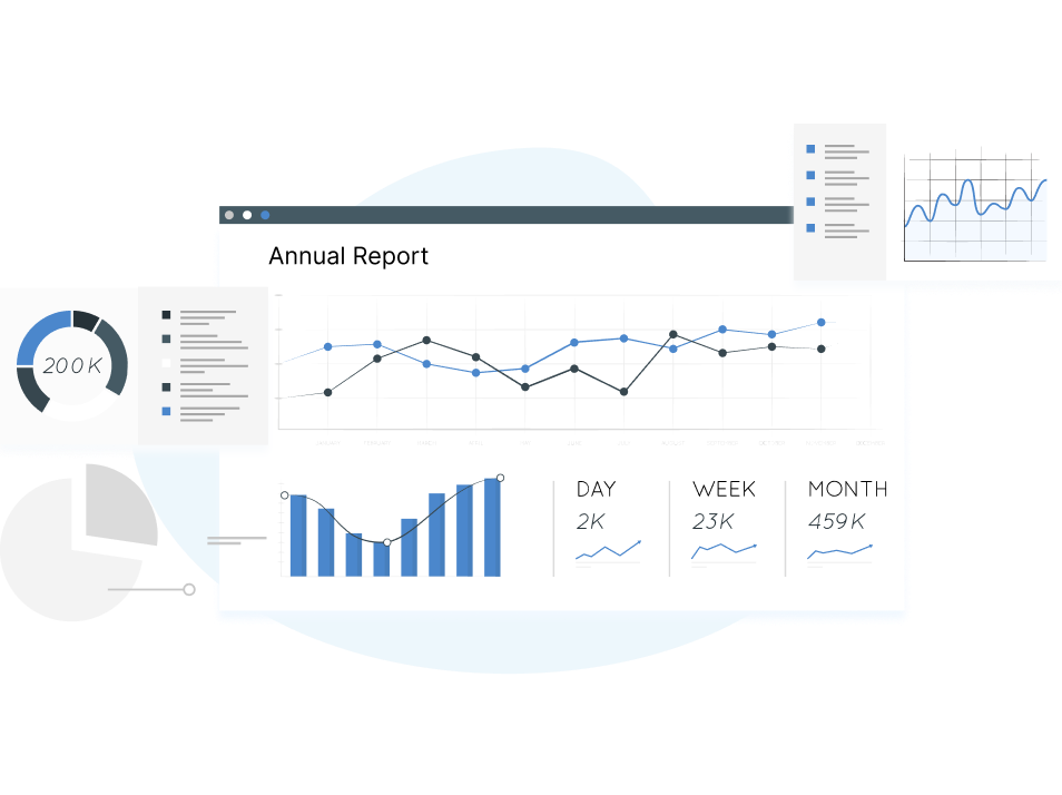
SaaS companies rely on data from various sources to draw insights and make data-driven decisions. Data visualization tools play a significant role in helping companies visualize and analyze data from multiple sources to grow their organization.
Amongst the various data visualization tools in the market, Databox and Klipfolio are the most popular, both in terms of features and user reviews. With the help of customizable dashboards and instant alerts, both Databox and Klipfolio enable companies to visualize, track and analyze all their data in a single interface.
Both have their fair share of pros and cons, making it difficult for customers to choose between the two. Through this blog, let us get into the nitty gritty of both data visualization tools to help SaaS businesses determine the best fit for their needs.

The tedious search for the perfect data visualization solution ends with Dataflo. Dataflo is a visualization tool that helps you track, analyze and visualize all your GTM metrics from multiple sources so that you can be at the top of your data and make informed business decisions.
Dataflo provides you with a well-defined overview of your marketing campaigns. You don’t have to worry about collecting your data from various sources; Dataflo automatically collects all your essential data and presents it to you in a comprehensible format.
One of the best features of Dataflo is its simple user interface. Professionals without a technical background can operate and analyze data seamlessly with Dataflo’s no-code design.
With integrations to an array of data sources, you can create and view all your data on a single dashboard in minutes. You can also receive instant alerts and notifications from Dataflo about your top metrics through Slack or your email, keeping you up-to-date on all your data.
A unique thing about Dataflo is that their pricing plans are affordable compared to other popular data visualization solutions in the market. Dataflo has different price ranges for their plans, so it is accessible to everyone and caters to their company’s needs.
Related: Have you locked in on Databox as your data visualization tool? Before you make up your mind, read about the top 5 alternatives for Databox.
With customizable dashboards and efficient data analytics, both Klipfolio and Databox enhance data visualization for businesses, both big and small. Let us look at some of their key features and see how they compare.


Dataflo, however, tops both Klipfolio and Databox in report sharing. Users can access, track, and download essential data on their Slack without having to visit Dataflo at all. With the help of a simple command, “/metric” on your inbox, you can view all your top metrics in a jiffy.
Related: Are you convinced that Klipfolio is the data visualization for you? Learn more about the top Klipfolio alternatives to explore your options.
Every company appreciates a good deal while getting a software subscription. Both Databox and Klipfolio have different pricing plans to fit every company’s needs. Here is a detailed breakdown of the pricing plans for Databox and Klipfolio.
Klipfolio has two different pricing plans for businesses and enterprises. Their prices are slightly steeper than those of Databox or other data visualization tools such as Dataflo. Let us look at their pricing plans in detail.
Klipfolio pricing plan for businesses:
Grow: $99/month, which includes 15 dashboards and unlimited users.
Team: $199/month, which consists of 30 dashboards and unlimited users.
Team+: $399/month, which consists of 60 dashboards and unlimited users.
Klipfolio pricing plan for enterprises:
They offer custom plans for enterprises starting at $499 per month.
Klipfolio offers a 14-day free trial for all their business and enterprise pricing plans.
Databox prices its plans based on the number of users apart from the additional features available with each plan.
Starter: $72/month.
The plan includes daily reporting and monitoring of data. It allows 5 users and 4 dashboards.
Professional: $135/month.
The plan includes hourly monitoring and analysis of data. It allows 25 users and 9 dashboards.
Performer: $231/ month.
The plan includes on-demand monitoring. It allows unlimited users and dashboards.
Databox offers a free forever plan with 3 data source connections and 60+ integrations.
While both Klipfolio and Databox offer several features for different price plans, Dataflo offers the most affordable prices compared to both Databox and Klipfolio. Dataflo offers growth and premium plans that provide unlimited users and dashboards along with a range of other worthwhile features.
They also offer a free plan with 3 dashboards and users per month. Check out the complete price specifications here.

Collecting and analyzing data is a crucial feature in every data visualization. Both Databox and Klipfolio have integrations with various data sources to enable seamless data collection to track and analyze. Let us look at some integrations and other specifications for Databox and Klipfolio.
You can integrate and customize your dashboards with some excellent data connectors. Klipfolio also enables you to import your data via pre-built REST/URLs, Excel sheets, or SQL connectors. You can also update your data using the automatic data input function.
Here are some of the most popular Klipfolio integrations:
Databox offers over 70 integrations, including APIs. The integrations are accompanied by a collection of metrics and 200+ pre-built reports, and pre-figured Data Blocks.
Some of the most popular integrations include:
Apart from the popular integrations, Dataflo also offers CRM integrations, including HubSpot CRM, Pipedrive, and Salesforce. The integrations also come with an array of GTM metrics that assesses and translates data from different applications across various tech stacks such as CRM, marketing analytics, and sales intelligence.
In any business, especially the SaaS industry, the user experience of the products or services is vital to the success of the business. Since SaaS companies function on the monthly subscription model, they must ensure that the products are user-friendly and backed up with good customer support. Let us look at how Databox and Klipfolio fare in these departments.
One of the best things about Klipfolio is that the User Interface is very easy to understand. Anyone can get up to speed with all the features and functions in no time.

Klipfolio enables a comprehensive report-building experience. This makes it easy for teams to track the KPIs and inspires them to take the necessary actions to achieve them.

In spite of the impressive user interface and dashboards, Klipfolio needs to catch up in terms of speed. The software lags when users attempt to implement complex actions or open multiple data sources simultaneously.

Databox has excellent customer support for its users. When dealing with an issue, customer support representatives respond within minutes to sort out issues the user might.

Databox is highly flexible and has an intuitive interface. Users add that they can create impressive dashboards within a few minutes with the help of their built-in integrations.

“The support team is insanely good. Anything that I need they help me with, I'm always blown away. Also, there are built in integrations for everything, so I can usually deliver a great dashboard with a couple of clicks.”
Even though their data integrations and dashboards are fantastic, in some cases, the data sources get disconnected, and the users lose their historical data. Creating custom reports may also be challenging since some users might need external spreadsheets to calculate the data.

Related: Are you in search of a better Looker Studio alternative? Read our blog to find out why Dataflo is a better alternative to Looker Studio for your data visualization needs.
Dataflo fares considerably well amidst data visualization tools such as Databox and Klipfolio in terms of user experience and overall satisfaction. The dashboards are easy to assemble, and the blocks can be resized and removed according to your comfort.
The users can also view and track the data from various data sources. The historical data can be saved for up to 6 months, making it easier for companies to track previous trends and customers’ purchasing behavior.
You can star your favorite metrics and track them with ease. Dataflo also enables you to schedule automated reports for your team and stakeholders to spare you the trouble of creating lengthy reports manually.
Now that we have covered all the features and reviews for Databox and Klipfolio let us quickly recap the pros and cons of both data visualization tools.
Pros
Cons
Pros
Cons
While Databox and Klipfolio are veterans in the data visualization industry, Dataflo makes collecting important data easier and displays them on a clutter-free, fully customizable dashboard. Creating custom dashboards is a piece of cake and can be accomplished within minutes.
Users can effectively share rapid alerts, notifications, and reports through Slack or email. They offer a list of other features and integrations for pricing plans affordable for companies and businesses of all kinds.
We have established that Databox and Klipfolio are excellent data visualization tools you can use to grow your business. Each of these tools is known for something. Databox is an ideal tool for advertising and marketing agencies looking for a comprehensive data visualization tool. Klipfolio, on the other hand, is more apt for advanced users with a tech background to make the most out of the tool.
If you are unsure about Databox and Klipfolio, you should Book a Demo with Dataflo. Dataflo makes it simple to compare and evaluate data to make data-driven decisions for your company. It is straightforward to use and provides a clear picture of how your marketing initiatives are doing, which enables you to accomplish your goals swiftly and successfully.
But at the end of the day, you must thoroughly research all your options to see which tool aligns most with your company’s needs. It is always a good idea to try out each tool to gauge its efficiency and value for the company before investing in any of them.


Ira is a writer and blogs about her love of words. She has been responsible for creating powerful and effective content that attracts and retains customers. A blend of her humble writing experience and an endeavour to inspire people with her words is on her table now. She is an avid reader and a music lover too. She loves to devote time each day to yoga and meditation in addition to going for walks.