Join Dataflo @ SaaS Insider's India 2022 on May 26 - 27
Register Now


In the fast-paced world of business intelligence (BI), staying ahead of the competition requires powerful tools that can turn vast amounts of data into actionable insights. And that's where SaaS BI tools come in handy. These tools have revolutionized the way organizations approach data analysis.
As we enter the year 2023, the landscape of SaaS BI tools is evolving rapidly, with innovative solutions emerging to address the growing demands of businesses across industries. In fact, according to Fortune Business Insights, the global business intelligence market will be $29.42 billion in 2023 and reach $54.27 billion by 2030.
In this article, we will explore the nine best SaaS BI tools that are set to rule the market in 2023. These tools offer a combination of advanced analytics, intuitive interfaces, and robust features that ensure marketers and businesses gain a competitive edge in today's data-driven world.
Let's delve into the exciting world of SaaS BI tools and discover the top contenders that are poised to dominate the BI market in 2023.
SaaS BI tools, or Software-as-a-Service Business Intelligence tools, are cloud-based software applications providing organizations with comprehensive data analytics and reporting capabilities. These data visualization tools let you collect, analyze, and visualize the data in real time to gain valuable insights and make informed decisions.
The key advantages of SaaS BI tools lie in their scalability, flexibility, and cost-effectiveness. Organizations can easily scale their usage as their data and user base grow without worrying about infrastructure limitations.
Additionally, SaaS BI tools typically follow a subscription-based pricing model, where users pay a recurring fee, making them more affordable and predictable than traditional BI software's upfront costs.

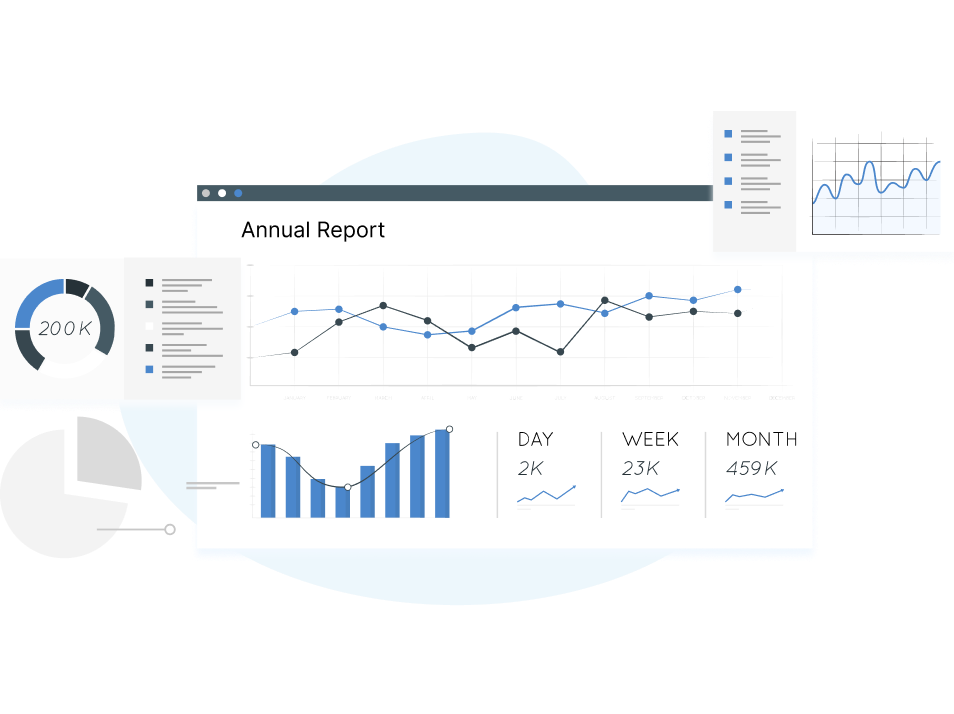
Dataflo is an advanced data visualization tool designed to empower businesses in collecting, analyzing, and visualizing their data. With Dataflo, organizations can efficiently compare intricate datasets and gain valuable insights into their interrelationships in real time. By harnessing these insights, companies can make informed decisions that drive their success.
Key Features
Dataflo offers a range of key features that enhance data monitoring and collaboration:
1. Custom Dashboard: Keep a close eye on important metrics by easily configuring a personalized dashboard that displays all essential information in one place.
2. Goal Monitoring: Stay on top of internal objectives by tracking progress against key performance indicators (KPIs) and ensuring alignment with organizational goals.
3. Slack Integration: Seamlessly integrate with Slack to automate report generation and scheduling. View crucial metrics and collaborate effortlessly through simple commands within the Slack platform.
4. Collaboration: Foster effective communication by tagging users and maintaining contextual discussions within the application. This feature ensures that relevant stakeholders are involved in conversations and remain up-to-date.
5. Subscription Dashboard: Gain valuable insights into revenue sources, reduce churn, and enhance customer retention. The subscription dashboard feature enables efficient analysis and optimization of subscription-based business models.
Limitations
Due to its advanced functionalities and features, dataflo may present a learning curve, particularly for businesses less familiar with BI tools.
Pricing
Dataflo offers the following pricing models:
Starter: Free includes up to 3 users + 3 datasources
Growth: $99 per/month with unlimited users + 10 datasources
Premium: $199 per/month with unlimited users + unlimited datasources

Microsoft Power BI is a leading business intelligence (BI) platform that empowers organizations to transform raw data into insightful visualizations and interactive reports. Its services are designed to facilitate data analysis, collaboration, and decision-making.
Key Features:
1. Data Preparation and Transformation – Power Query, a data preparation component of Power BI, enables users to clean, shape, and transform data for analysis. It offers a user-friendly interface to perform data wrangling tasks, ensuring data is accurate and suitable for visualization.
2. Data Preparation and Transformation – Power Query, a data preparation component of Power BI, enables users to clean, shape, and transform data for analysis.
3. Mobile Accessibility – Power BI offers native mobile applications for iOS and Android devices. So, marketers can access and interact with their reports and dashboards on the go, enabling data-driven decision-making anytime, anywhere.
Limitations:
Data Volume and Performance - Power BI may experience limitations with very large datasets, which can impact performance and responsiveness. Organizations with substantial data volumes should consider optimizing data models and utilizing Power BI Premium or Power BI Premium Per User licenses for enhanced performance.
Pricing:
Microsoft Power BI tool is available in different pricing tiers, from a free option to premium and professional. You can contact their sales team or visit their official website pricing page for more information.

Zoho Analytics is a comprehensive cloud-based business intelligence (BI) and analytics platform that empowers organizations to analyze and derive insights from their data. It offers various features designed to facilitate data exploration, reporting, and collaboration.
Key Features:
Data Preparation and Cleansing: The platform provides tools to clean, transform, and prepare data for analysis. Users can perform data cleansing, enrichment, and aggregation tasks to ensure accurate and reliable results.
Visual Analytics and Reporting: Zoho Analytics offers a rich library of interactive visualizations and reporting capabilities. Users can create customizable dashboards, charts, and pivot tables to visually represent and explore their data.
Advanced Analytics: The platform supports advanced analytics features such as forecasting, trend analysis, and statistical modeling. Users can leverage these capabilities to uncover patterns, correlations, and predictive insights within their data.
Limitations:
Learning Curve - Zoho Analytics may have a learning curve, especially for users new to business intelligence and data analytics. Some features and advanced functionalities may require time and effort to master.
Pricing:
The pricing is based on factors such as the number of users, data storage, and advanced features required. For pricing information, visit the Zoho Analytics website pricing page or contact their sales team.

Cyfe is a complete all-in-one dashboard and analytics device that allows corporations to display and examine their key metrics and records from numerous sources in actual-time. It offers a number of functions designed to offer customers a holistic view of their commercial enterprise performance.
Key Features:
Customizable Dashboards: Users can create customized KPI dashboards using pre-built widgets or by building their own custom widgets. This allows for personalized data visualization and real-time monitoring of important metrics and KPIs.
Data Visualization: With an extensive selection of visualization options, users can tailor their data presentation to meet their unique requirements with ease.
Automated Reporting: Cyfe allows users to automate the generation and delivery of reports. This feature saves time and effort by enabling scheduled reports to be sent to stakeholders via email or exported in various formats.
Limitations:
Data Manipulation: Cyfe offers limited data manipulation and transformation capabilities compared to dedicated data preparation tools. Users may need to perform data cleansing and manipulation tasks in their source systems before integrating the data into Cyfe.
Pricing:
Cyfe offers different pricing plans, including a Free plan with limited features and paid plans with additional functionalities and customization options. For pricing details, you can visit the Cyfe website pricing page or contact their sales team.

Qlik Sense is a powerful self-service BI platform that allows users to explore and analyze data in an intuitive and interactive manner.
Key Features:
Associative Data Model: Qlik Sense utilizes an associative data model, which enables users to dynamically explore data relationships. It allows for seamless data navigation and discovery, empowering users to uncover hidden insights and explore data from multiple angles.
Mobile Accessibility: Qlik Sense provides native mobile applications, enabling users to access and interact with their data on smartphones and tablets.
Data Visualization: Qlik Sense provides a wide array of interactive visualizations, including charts, graphs, maps, and tables. Users can create compelling visual representations of their data to gain insights and communicate findings effectively.
Limitations:
Limited Native Data Transformation: While Qlik Sense offers some data preparation features, it may have limitations in terms of advanced data transformation and cleansing capabilities. Users may need to perform data preparation tasks in external systems before integrating the data into Qlik Sense.
Pricing:
Qlik Sense offers flexible pricing options based on the specific needs and requirements of the organization. So, you have to contact their sales team for custom pricing details.
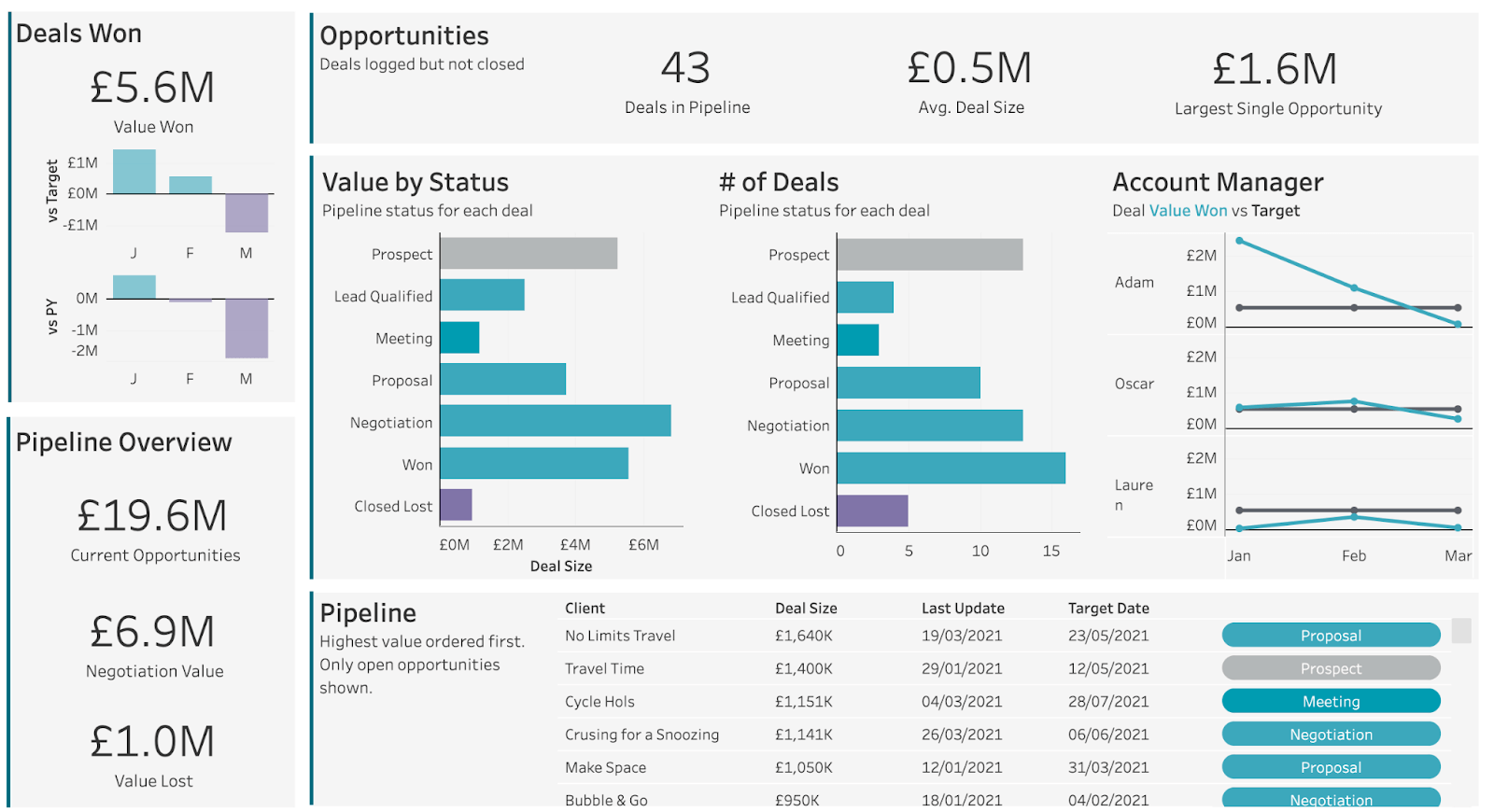
Tableau Desktop is a highly capable data visualization tool that forms part of the broader business intelligence (BI) suite. Renowned for its robustness and user-friendly interface, this tool is particularly favored by data scientists and analysts seeking the flexibility to create dynamic custom charts and intricate visual representations of data.
Key Features:
Data Connection and Integration: Tableau connects to various data sources, including databases, spreadsheets, cloud services, and web data connectors. It supports seamless data integration, allowing users to combine and analyze data from multiple sources.
Drag-and-Drop Interface: Tableau provides an intuitive interface, allowing users to easily build and modify visualizations without coding or scripting. It empowers users to explore data and create meaningful visualizations quickly.
Ad-Hoc Analysis: Tableau facilitates ad-hoc analysis, allowing users to dynamically explore data, drill down into details, and ask on-the-fly questions. This interactive approach enables users to gain deeper insights and make real-time data-driven decisions.
Limitations:
Advanced Analytics Functionality: Tableau provides basic analytics capabilities but may not offer the same level of advanced analytics functionality as specialized data science tools.
Pricing:
Tableau offers different pricing tiers that include creator, explorer, and viewer. For detailed and up-to-date pricing information, it is recommended to visit the official Tableau website or contact their sales team.

Domo is a user-friendly cloud-based BI tool that simplifies data analysis, predictive analytics, and generating valuable insights. With Domo, you get a comprehensive and robust solution that encompasses all essential components, including data warehouses, ETL (Extract, Transform, Load) processes, powerful visualizations, and insightful reports.
Key Features:
Real-Time Data Updates: Domo provides real-time data updates and alerts, ensuring users have access to the most current information. It enables timely decision-making by delivering up-to-date insights to users across the organization.
Data Integration: Domo supports seamless integration with numerous data sources, including databases, spreadsheets, cloud services, and APIs. It enables users to consolidate data from multiple systems and gain a holistic view of their business.
Advanced Analytics and AI Integration: Domo offers advanced analytics capabilities, including predictive analytics and machine learning integration. Users can leverage these features to uncover patterns, predict outcomes, and gain deeper insights from their data.
Limitations:
Customization Limitations: Domo's customization options for visualizations and dashboards may have certain limitations compared to other BI tools. Users seeking highly granular or specific customizations may find some constraints.
Pricing:
There is no fixed pricing option for Domo. Instead, the pricing structure is customized to reflect the specific needs and scale of individual companies. This means that pricing can vary from one company to another. So, it is recommended to contact their sales team or the pricing page on their website for more information.

Sisense is a powerful business intelligence (BI) tool designed to enable businesses to understand and leverage their data effectively. By gathering data from diverse sources, Sisense performs data cleansing and analysis to uncover valuable insights, trends, and patterns.
Key Features:
Interactive Dashboards and Visualizations: Sisense provides interactive dashboards and a wide range of visualizations, such as charts, graphs, and maps. Users can create dynamic visual representations of their data, enabling intuitive exploration and analysis.
Data Modeling and Transformation: Sisense allows users to model and transform their data using a user-friendly interface. It supports advanced data modeling techniques, making it easier to structure data and create meaningful relationships.
Embedded Analytics: Sisense facilitates the embedding of analytics into other applications, portals, or websites. This enables organizations to deliver data-driven insights directly to their customers, partners, or internal stakeholders.
Limitations:
Limited Predictive Analytics: While Sisense offers some basic predictive analytics functionalities, it may not have the same level of advanced predictive modeling capabilities as specialized data science tools.
Pricing:
Sisense offers a flexible pricing model based on the specific requirements and scale of each organization. For more information, it is recommended to visit the official Sisense website or contact their sales team.

Looker is a cloud-based BI platform that focuses on delivering data exploration and analytics capabilities. If you are looking for a BI tool that is easy to use, scalable, and affordable, then Looker is a great option.
Key Features:
Embedded Analytics: Looker enables organizations to embed analytics and data visualizations directly into their own applications or websites. This allows for seamless integration of data insights into existing workflows and user experiences.
Collaboration and Sharing: Looker facilitates collaboration by allowing users to share reports, dashboards, and insights with colleagues and stakeholders. It supports features such as commenting, data annotations, and data sharing permissions.
Data Governance and Security: Looker provides robust data governance and security features, allowing administrators to control access to data, manage user permissions, and ensure compliance with data privacy regulations.
Limitations:
Learning Curve: Looker's powerful features may have a steeper learning curve for users who are new to BI tools or have limited technical expertise. It may require some training and familiarity with data modeling concepts.
Don't forget to check out our blog on the alternatives for Looker Studio if you're seeking other options in the market.
Pricing:
Looker's pricing options vary across their Standard, Enterprise, and Embed editions. For detailed pricing information specific to your organization's needs, it is advised to consult with Looker's sales team.
Choosing the right Software-as-a-Service (SaaS) Business Intelligence (BI) tool for your business is crucial to effectively harnessing your data and driving informed decision-making. Here are some key factors to consider when making your selection:
Ease of Use and User Experience:
Consider the tool's user interface, ease of navigation, and intuitiveness. A user-friendly tool will enhance adoption and enable non-technical users to access and interpret data easily.
Integration Capabilities:
Determine how well the tool integrates with your existing systems, databases, and other data sources. Look for compatibility with the platforms you use and ensure smooth data integration and connectivity.
Data Security and Compliance:
Evaluate the tool's data security measures, including encryption, access controls, and compliance with relevant regulations (e.g., GDPR, HIPAA). Protecting your data and ensuring compliance with privacy standards is vital.
Analytics and Visualization Features:
Assess the tool's analytics capabilities, including data modeling, advanced analytics, predictive modeling, and machine learning integration. Look for a wide range of visualization options and the ability to create interactive dashboards and reports.
Support and Training:
Consider the level of support and training offered by the BI tool provider. Look for resources such as documentation, training materials, online forums, and responsive customer support to assist you in effectively using the tool.
Business intelligence tools are essential for companies to analyze and visualize their data, particularly for SaaS companies where data holds significant importance. Selecting the appropriate platform is crucial for optimizing business efficiency.
Factors like your company's needs and size should be considered when making this decision. The business intelligence automation platforms mentioned in this article are highly recommended and have the potential to drive transformative outcomes for your business over time.
If you're searching for a data visualization tool that prioritizes simplicity and efficiency, your search ends with Dataflo. With its customizable dashboard and an array of appealing features, Dataflo is designed to help you efficiently track your business and thrive in your industry. Don't miss out on this opportunity – Book a demo with dataflo today!


Ira is a writer and blogs about her love of words. She has been responsible for creating powerful and effective content that attracts and retains customers. A blend of her humble writing experience and an endeavour to inspire people with her words is on her table now. She is an avid reader and a music lover too. She loves to devote time each day to yoga and meditation in addition to going for walks.