Join Dataflo @ SaaS Insider's India 2022 on May 26 - 27
Register Now


Above all else, show the data.
Data is everywhere, and marketers are inundated with it from various sources: customer relationship management (CRM) tools, Google Analytics, and Google Search Console—to name a few.
As a Marketer, data helps identify and connect with new customers and lets you figure out what your current customers want. You can use data to predict user behavior and adjust your strategy accordingly.
But have you ever felt like your marketing or sales data is drowning you? You're not alone.
It can be easy to get lost in a sea of numbers when trying to figure out what's working and what's not.
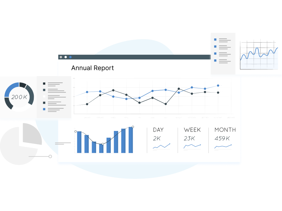
This is where a favorite dashboard comes into play for marketers like you who want to visualize their metrics across different datasources in one place and analyze them instantaneously.
In this article, we'll address everything about Favorite Dashboard and how you can effectively pull metrics and report across different datasources.
A Favorite dashboard is one place where you can group all your metrics of different datasources that you want to measure expeditiously.
Let's take a look at the daily life of a Product marketer. It's obvious that Marketers and LinkedIn make the best pair. You run a Campaign on LinkedIn and measure it often, but your campaign limit continues beyond there. It will extend to Google, Facebook, Twitter, and other social platforms.
Wouldn't it be great if you could visualize all the metrics across different datasources effectively in a single holistic view by saving your time?
This way, you can save time by monitoring the metrics that matter most without going through each source individually.
We know how challenging it can be for marketers to present their data on Monday morning, you have to pull data from different sources, make sure it's all in one place, and then figure out how to present it in a way everyone can understand. It's like pulling teeth.
Taking a scenario of a Growth Manager, you want your team to follow up on the leads converted from the campaigns you ran on LinkedIn and Twitter. You'll need to measure CTR and Conversions from LinkedIn and Twitter Ads to monitor their performance.
Simultaneously, you'll be looking at Leads, Deals created, Deals won, and Deals lost in your Pipedrive (or whatever CRM you're using within your organization). Now again, you'll have to hop on to your CRM, filter the data for a specific time range, and then look into it.
The truth is, you need a way to make sense of all that information—and fast.
In this case, your favorite dashboard can help you with all the necessary metrics. At times you don't even have to present it through a meeting. Instead, all you have to do is set up the favorite dashboard with the metrics your manager wants so they can access it whenever they get time to look at them.
For marketers keen on direct data analysis without the fuss, Dataflo's Favorite Dashboard is a game-changer. This no-code platform consolidates data from diverse sources, providing a comprehensive view in one unified dashboard. Experience the power of streamlined data visualization firsthand. Book a demo with Dataflo today and elevate your analytics approach.
1. Connect multiple datasources
With Dataflo, you can connect to various datasources and combine them into a single dashboard. This makes your marketing efforts more effective as you can easily understand the performance of different channels across multiple social media campaigns or paid ads.
2. Pre-set time ranges
In Dataflo, data can be viewed for a particular period of time. For instance, last month, this month till date, or a year till now. With this feature, you can analyze performance over a range of time periods.
3. Collaborate
Each metric card in Dataflo allows you to collaborate with your team. It will enable you to leave a comment and tag a team member and have a real-time data conversation. When the marketing head analyze the data and needs information communicated back, they can leave comments within the metric card itself.
4. Goals
Monitoring your metrics in real-time helps you stay on top of progress toward your goals. In the Favorite dashboard, you can set goals for your metrics and monitor the progress against the target in real-time, and it also allows you to assign a goal owner to each goal.
Let's look at how to set up your Favorite dashboard in Dataflo and view the metrics that matter most to you.
1. Connect your datasources
The first step towards setting up the Favorite dashboard is to connect your datasources with Dataflo you want to measure.

2. Mark the metrics
Then, mark the metrics and KPIs you want to see in the metric cards across each of your datasources.
.png)
3. View the metrics
The metrics you've marked across different datasources will be taken into account and displayed together in one unified dashboard.

4. Remove the metrics
In the Favorite dashboard, you can remove any metric that doesn't serve your purpose with just one click.
.png)
It's not easy to get a holistic view of your company's data, but it's essential for making smart decisions. When you want a high-level look at a specific piece of information or company, you need tools like Dataflo.
With Dataflo's Favorite dashboard, you can measure and improve your company's performance in one centralised place, so analysts don't have to spend time looking in multiple places.


Keerthi is passionate about building products. She contributes towards product strategies and is responsible for managing the company’s analytics platform and creating new products that meet the customer’s needs. In her spare time, you can find her enjoying baking, painting and listening to music. She loves capturing and documenting priceless moments of her life.