Join Dataflo @ SaaS Insider's India 2022 on May 26 - 27
Register Now


In today's fast-paced digital landscape, data analytics has become the lifeblood of business success. As HockeyStack revolutionized the way companies derive actionable insights, the quest for the perfect analytics solution continues to evolve. Are you ready to take your analytics game to unprecedented heights?
Join us on a thrilling exploration of the eight best alternatives to HockeyStack that promise to transform the way you harness data. From cutting-edge features to customizable platforms, we've handpicked each alternative for its unique ability to supercharge your analytics endeavors.
Step into the future of data analytics as we unveil the game-changers that will empower you to make data-driven decisions with confidence. Embrace the power of analytics, embrace success. Let's embark on this thrilling ride together!

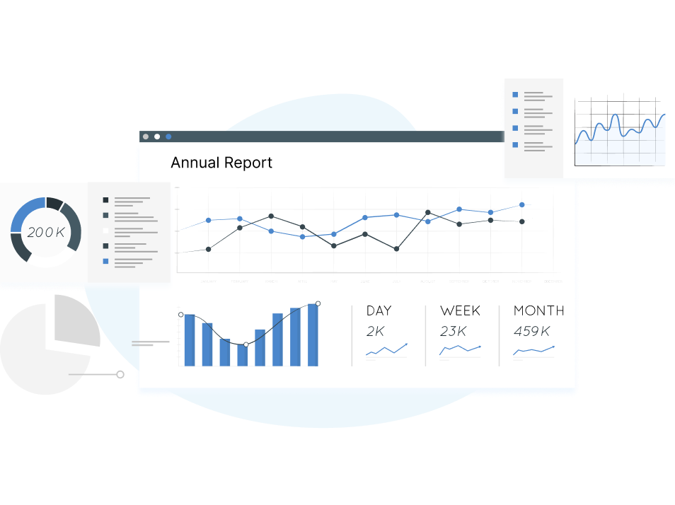
HockeyStack is a versatile data analytics tool specifically designed for B2B businesses as it empowers them to present data in a visually appealing and easily digestible format. This capability enables organizations to effectively convey complex information, statistics, and trends to stakeholders, clients, and team members, fostering clearer communication and facilitating informed discussions.
It offers a range of features to help users analyze and optimize their marketing campaigns. Here's an overview of its key features:
HockeyStack supports connections with various platforms, including Google Analytics, Google Ads, Facebook Ads, LinkedIn Ads, and HubSpot. These integrations enable users to centralize their marketing data and comprehensively view their campaigns' performance.
HockeyStack adopts a tiered pricing structure based on the number of monthly tracked users or sessions. The pricing plans typically include features such as funnel analysis, custom tracking events, customer journey mapping, and email support. Visiting HockeyStack's official website or contacting their sales team for detailed pricing information tailored to specific business requirements is recommended.
It is important to be aware of certain limitations associated with HockeyStack. We have mentioned them below for your reference.
Some users have reported issues with data accuracy, including discrepancies between HockeyStack's data and other analytics platforms. It is essential to monitor and cross-validate the data to ensure its reliability.
The initial learning curve can be steep for first-time users, particularly when setting up and configuring tracking events and integrations. Adequate training and support may be necessary to maximize the tool's potential.
While HockeyStack provides email support, users may have varying experiences with the level of support and documentation available. Assessing alternative tools for their customer support responsiveness and availability of comprehensive documentation can be beneficial for smooth implementation and troubleshooting.
HockeyStack’s AI insights may lack comprehensive information. It can restrict marketers' understanding of customer behaviour, ultimately impacting the effectiveness of their campaigns. Without detailed insights, creating targeted and engaging marketing initiatives becomes challenging, which can result in lower levels of customer engagement and reduced conversion rates.
Now that we have understood the limitations of HockeyStack, lets have a look at the best alternatives you can try instead of it.

Dataflo is a powerful data visualization solution tailored for SaaS businesses, providing holistic marketing data visualization. Its user-friendly interface, streamlined data collection, customizable dashboards, and integration with Slack make it a valuable tool for marketers. With Dataflo, marketers can make data-informed decisions, track their progress, and drive their marketing efforts towards success.
It offers a range of features to help users visualize and analyze their marketing data across multiple sources. Here is an overview of its key features:
Multi-Source Data Visualization: Dataflo allows users to consolidate and visualize marketing data from various sources, providing a comprehensive view of their marketing efforts in a single dashboard. This feature enables users to track and analyze metrics from different platforms, such as Google Analytics and Facebook Ads.
Metric Tracking and Comparison: With Dataflo, users can easily track and compare key metrics over time. The platform provides intuitive tools to identify trends, patterns, and anomalies, helping users understand the effectiveness of their marketing strategies and make data-driven decisions.
Customizable Dashboards: Dataflo enables users to create personalized dashboards tailored to their needs. Users can select the metrics and visualizations they want to see, arranging them to suit their preferences.
Integration with Slack: Dataflo integrates seamlessly with Slack, a popular team communication platform. Users can receive instant alerts, daily metric reports, and collaboration notifications directly within their Slack channels.
Dataflo provides flexible pricing plans to cater to different business needs. Here are the available options:
Additionally, Dataflo provides a 14-day free trial, allowing users to experience all the features and capabilities of the platform without any upfront commitment.

Whether a seasoned data analyst or a non-technical user, Databox empowers you to generate powerful visualizations that effectively communicate your data story. It was specifically designed to eliminate the need for coding, making data visualization accessible to anyone.
With Databox, users can start from scratch with a blank canvas or leverage pre-built templates for a quick start. The intuitive drag-and-drop interface allows users to seamlessly add data, customize colours and fonts, incorporate effects such as gradients and shadows, and more.
Databox offers a wide range of features to enhance your analytics experience:
Key Metric Calculation: Access data from various sources and effortlessly calculate key metrics, conversion rates, return on investment (ROI), and more without coding or complex formulas.
Goal Tracking: Define, assign, and track progress towards SMART Goals within a single screen. Keep a close eye on your objectives and monitor your team's progress.
Daily/Weekly Scorecards: Stay informed with regular updates on your most important key performance indicators (KPIs). Receive daily, weekly, or monthly scorecards via email, mobile push notifications, or through integration with Slack, ensuring you are always up to date on your performance.
Alerts and Insights: Databox provides alerts when your performance is off track and offers valuable insights on improving and optimizing your performance.
Extensive Integrations: Databox integrates with various platforms and tools, including Slack, Mailchimp, HubSpot Marketing Hub, Google Sheets, PayPal, Google Analytics 360, Instagram, etc.
Databox offers a variety of pricing plans tailored to accommodate businesses of various sizes and requirements. The available tiers include free, starter ($72 per month), professional ($132 per month), and performer ($231 per month). For the most accurate and current pricing details, it is advisable to visit Databox's official website.

Klipfolio is a powerful data visualization tool that empowers users to effortlessly create professional charts and graphs. It is particularly beneficial for businesses seeking valuable insights from their data and individuals looking to share visually appealing charts seamlessly.
It is highly adaptable and accommodates different data sets, ensuring compatibility with various sources and formats. Additionally, the platform offers a wide range of templates and formatting options, allowing users to customize and enhance their final visualizations to meet their specific needs.
Interactive Data Visualization: Visualize your data in real time, allowing you to make informed decisions based on up-to-date information. The interactive nature of Klipfolio's visualizations enable dynamic exploration and analysis of your data.
Customizable Dashboards: Design customized dashboards by incorporating a variety of charts, graphs, and other data visualizations to perfectly align with your specific needs and preferences.
Live Updating and Sharing: Keep your stakeholders in the loop by easily sharing your dashboards. Klipfolio supports live updating, ensuring viewers can access the most recent data.
Klipfolio offers a variety of pricing models to accommodate different business needs. The Plus plan is priced at $99/month, the Pro plan at $229/month, and custom pricing options are available for larger teams. For enterprises, custom plans start at $499/month.

Geckoboard is a robust data visualization and dashboarding tool that allows businesses to transform their data into meaningful visual displays. The platform offers a wide range of pre-built widgets and customizable templates, enabling users to design and customize their dashboards according to their needs.
Data Integration: Geckoboard seamlessly connects with various data sources, including spreadsheets, databases, and popular third-party services like Google Analytics, Salesforce, and Zendesk. It allows users to consolidate and visualize data from multiple sources in one central location.
Customizable Dashboards: Users can create visually stunning and interactive dashboards using a wide range of pre-built widgets and customizable templates. Geckoboard enables easy drag-and-drop functionality, empowering users to design and arrange their dashboards according to their specific requirements.
Real-Time Data Updates: Geckoboard supports real-time data updates, ensuring users can access the most current information. This feature enables businesses to monitor key metrics and track performance trends in real-time, enabling timely decision-making.
Geckoboard offers pricing plans, including Basic starting at $49/month for small teams, Team starting at $159/month for growing teams, and custom pricing for larger teams and enterprises, with a free 30-day trial to explore the platform's capabilities and determine the best fit.

Whatagraph is a user-friendly data visualization tool that simplifies creating visually appealing reports and dashboards. Its seamless data integration, pre-built report templates, customization options, and automated reporting features make it an asset for businesses seeking to present their data clearly and effectively.
Pre-built Report Templates: The tool provides a vast library of pre-built report templates covering various marketing and business metrics. These templates offer a quick and convenient way to create professional-looking reports tailored to specific needs.
Automated Reporting: Whatagraph enables users to automate the reporting process by regularly scheduling and delivering reports to stakeholders. This feature eliminates manual report generation, saving time and ensuring up-to-date information is readily available.
Customization Options: Users can personalize their reports by adding their branding elements, customizing colour schemes, and including additional insights and comments. This customization ensures that reports align with the brand's visual identity and messaging.
Whatagraph offers tiered subscription plans tailored to different business needs: Starter, starting at $99/month for small teams with basic reporting needs; Business, starting at $229/month for growing teams with more data sources and advanced reporting requirements; and Agency, with custom pricing for agencies and larger organizations with multiple clients and extensive reporting needs.

DashThis is a widely-used data visualization and analysis tool that enables users to effectively make sense of their data. With DashThis, users can effortlessly create visualizations, collaborate with others, and share their findings with clients or colleagues, leading to informed decision-making in their business. The platform offers the flexibility to customize dashboards by adding custom widgets, logos, headers, and notes, ensuring that the dashboard aligns with the business's specific needs.
Customized Reports – It provides the flexibility to generate customized reports that meet your requirements. You can filter out fields and choose from various visualizations like pie charts or line graphs to present your data effectively.
Customizable Dashboards – This allows you to personalize the look and feel of your dashboard by selecting themes and toggling between light or dark modes to match your preferences.
Real-time Updates - DashThis lets you keep track of your metrics and provides consistent and frequent updates in real time, ensuring you have the most up-to-date information at your fingertips.
DashThis provides a range of pricing models to cater to different user needs. The Individual plan is priced at $45, the Professional plan at $139, the Business plan at $269, and the Standard plan at $419. These plans offer varying features and capabilities to accommodate different business sizes and requirements. Additionally, DashThis offers a 15-day free trial, allowing users to explore the platform and evaluate its suitability before committing to a subscription.

Octoboard is a powerful tool that helps businesses visualize and monitor their key performance indicators (KPIs) through customizable dashboards and automated reports. It offers many features designed to simplify data analysis and reporting processes.
Automated Reports – It offers automated reporting, allowing users to schedule and deliver reports to stakeholders regularly. This feature saves time and effort by eliminating the need for manual report generation and providing up-to-date insights and analysis to decision-makers.
White-labelling options – This option enables businesses to brand their dashboards and reports with their own logos and visual identity. When sharing data with clients or executives, it helps create a cohesive and professional impression.
Customizable Dashboards - Users can choose from a wide selection of pre-built widgets or create custom widgets to present specific KPIs. These dashboards can be easily shared with team members, clients, or stakeholders to ensure everyone is on the same page.
Octoboard offers a range of pricing plans tailored to different needs: Essential starts at $29/month for small businesses requiring basic reporting, Agency starts at $99/month for agencies and larger organizations needing advanced reporting and white-labelling, Team starts at $249/month for growing teams with collaboration features, and Enterprise provides custom pricing with advanced features.

Looker Studio is a powerful data visualization tool that enables users to create interactive dashboard reports from multiple data sources. It provides users with comprehensive features to transform raw data into meaningful insights. As a web-based application accessible from any internet-connected device, it offers a range of key features to enhance data exploration and analysis.
Drag-and-Drop – This functionality lets users easily build visualizations by dragging data fields onto the canvas. It allows for the quick and seamless creation of charts, graphs, and other visual data representations.
Data Connectivity - Users can leverage data from multiple sources to gain comprehensive insights. Some data integrations include Amazon Redshift, Microsoft Azure SQL database, and Google Cloud platform.
Customizations – It provides various visualization options, including bar charts, line charts, scatter plots, and heat maps. Users can customize the appearance and formatting of their visualizations to convey their data effectively and make it visually appealing.
The Simple plan starts at $1,000 monthly and includes up to 10 users and 100 GB of data storage. The Enterprise plan starts at $10,000 monthly and supports up to 100 users and 1 TB of data storage.
Choosing the right analytics tool for your business requires careful consideration of several factors. Here are some steps to help you make an informed decision:
Identify the specific objectives you want to achieve with an analytics tool. Determine the key metrics and data points for measuring your progress towards these goals.
Evaluate your data type and volume and anticipate future growth. Consider the sources from which you collect data and the level of complexity involved in data integration.
Make a list of essential features and functionalities for your business. It could include data visualization capabilities, data exploration, real-time reporting, custom dashboard creation, collaboration options, and integrations with other tools or platforms.
Look for a user-friendly and intuitive tool. Consider the learning curve for your team and ensure that the tool provides a smooth onboarding experience.
Assess whether the tool can accommodate your business's growth and changing needs. Consider if it allows you to scale your usage, add more users, and handle increasing data volumes.
Ensure the analytics tool seamlessly integrates with your existing systems and data sources. It includes compatibility with your data storage platforms, marketing automation tools, CRM systems, or other relevant applications.
Compare the pricing models and plans offered by different analytics tools. Consider the value you will get from the tool regarding the insights gained, the time saved, and the impact on your business goals.
Research reviews from other businesses or industry experts to gain insights into the strengths and limitations of different analytics tools. Seek recommendations from peers in your industry who have similar data analytics requirements.
By following these steps and considering your unique business needs, you can choose the analytics tool that aligns best with your goals, data requirements, user experience, and budget.
If you are looking for an alternative to HockeyStack, you can find several options in the market. While making a choice, finding the tool that best suits your business requirements is essential. With various options available, selecting the one that aligns with your specific needs and goals is key.
Take the time to evaluate each tool's features and capabilities to ensure it can effectively meet your analytics and data visualization needs. Choosing the right tool can enhance your business's data analysis and make informed decisions based on accurate insights
In the quest for an efficient and straightforward data visualization tool, do consider Dataflo as it is designed to help you efficiently track your business and thrive in your industry.


Ira is a writer and blogs about her love of words. She has been responsible for creating powerful and effective content that attracts and retains customers. A blend of her humble writing experience and an endeavour to inspire people with her words is on her table now. She is an avid reader and a music lover too. She loves to devote time each day to yoga and meditation in addition to going for walks.