Join Dataflo @ SaaS Insider's India 2022 on May 26 - 27
Register Now


As a company, you're constantly collecting data from various sources, such as customer interactions, sales figures, and website traffic.
But how do you turn all that raw data into actionable insights that can drive growth and success for your business? The answer lies in dashboard reporting. It provides a centralized location to quickly and easily access the data you need to make informed decisions.
In this blog post, we will explore what dashboard reporting is, how it works, and how it can help your SaaS company streamline operations, improve customer satisfaction, and ultimately achieve your business goals.
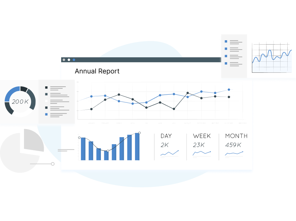
A dashboard report is a visual representation of data that provides a quick and concise overview of key performance indicators (KPIs) and metrics relevant to a specific business or project.
It can be used to track progress toward specific goals, monitor trends over time, and identify areas that require attention. It can also be customized to suit different user needs, such as executives, managers, or team members, and can be updated in real-time to provide up-to-date information.
As already mentioned, dashboards provide real-time information on critical metrics and KPIs. Executives, managers, or team leaders frequently use them to monitor performance, spot patterns, and make well-informed decisions.
On the other hand, a report is a more thorough document that offers a detailed examination of a specific subject, project, or area of a firm. They can have several sections, tables, and charts and are frequently lengthier and more intricate than dashboards.
In summary, while both dashboards and reports are tools for presenting information, dashboards are designed to provide a quick and concise overview of key performance indicators.
In contrast, reports are more comprehensive and detailed documents that provide in-depth analysis of specific topics.
There are several types of dashboard reporting, each with its purpose and focus. We have mentioned information on each dashboard reporting type for your reference. Please remember that the sort of dashboard reporting best suitable for a certain project or business will rely on the organization's unique goals and objectives and the data most pertinent to attaining those goals.

These dashboards give users a real-time or almost real-time view of operational data, including indicators for customer service, sales, and production rates. They support managers and staff in keeping track of performance, spotting patterns, and making wise decisions.
These dashboards focus on high-level, strategic data and provide an overview of key performance indicators (KPIs) important to senior executives and business leaders. They typically include information on revenue, market share, and profitability and are used to help executives track progress toward strategic goals.
These dashboards are designed to provide in-depth data analysis, often using advanced analytics and data modelling techniques. Analysts and data scientists frequently use them to spot patterns, trends, and linkages in data that might not be immediately obvious.
These dashboards provide a view of data specific to an organisation's department or team. They often monitor progress towards specific goals or objectives and identify areas requiring attention.
These dashboards mostly concern financial information, including sales, costs, and profitability. Financial managers and executives frequently use them to track financial performance, spot patterns, and reach well-informed judgments.
These dashboards focus on HR-related data, such as employee turnover, recruitment metrics, and performance evaluations. HR managers typically use them to monitor employee performance and identify areas for improvement.
Dataflo Sales Dashboard offers a unified view for sales funnel performance tracking, KPI monitoring, automated reporting, and seamless collaboration, all tailored to simplify your analytics process.

Here are some main reasons dashboard reporting is the best for your business.
Dashboard reporting offers insights into metrics and key performance indicators (KPIs) crucial to a project or organisation in real-time or very close to real-time. This helps the managers and decision-makers take prompt, well-informed actions that benefit the company.
When market conditions change, sales managers can adjust their strategies and methods. A sales dashboard offers real-time information on sales performance, which is one approach to achieving this. This could help increase revenue and sales performance.
Dashboard reporting helps identify trends and patterns in data that may not be immediately apparent. Managers and decision-makers can use this to spot problem areas and take proactive measures to fix them.
For example, a marketing dashboard helps to identify trends in website traffic or social media engagement, which can be used to adjust marketing strategies and tactics to reach target audiences better and improve engagement.
Data-driven decision-making is made possible via dashboard reporting, which improves corporate performance and results. Dashboard reporting can assist decision-makers in understanding the effects of various strategies and tactics rapidly and making wise choices by offering simple-to-understand visualisations of the data.
A project management dashboard, for instance, can provide real-time information on the status and performance of a project, allowing project managers to prioritise activities and effectively allocate resources to ensure that projects are completed on time and under budget.
Dataflo is an impactful platform that streamlines your team's data visualization and analysis of marketing metrics from multiple business applications.
By leveraging Dataflo, you can minimize the time spent on report generation and maximize the time spent on utilizing valuable insights
Dashboard reporting provides several benefits for businesses and organizations. Some of the key benefits include:
Creating dashboard reporting can be challenging, and some of the common challenges include:
Ensuring the data used to generate the dashboard is accurate and dependable is one of the biggest problems in dashboard reporting. Poor decision-making could result from the dashboard's inability to deliver precise insights if the data is inadequate or wrong.
Dashboard reporting often requires data from multiple sources, which can be difficult to integrate. Integrating all data can be highly challenging, especially for businesses with a lot of data.
The user interface design of a dashboard is critical to its success. It must be user-friendly, intuitive, and visually beautiful. This might be difficult since many users could have varied requirements and preferences for how the data is displayed.
It can be difficult to offer the option to customise dashboards for specific users or teams since it necessitates an in-depth knowledge of each user's requirements and preferences.
It is crucial to ensure that sensitive data is safeguarded and that only authorised individuals can access the dashboard. It can be difficult to implement effective security measures, particularly for companies with intricate IT systems.
Creating a dashboard report is an essential part of modern data analysis. Dashboard reports are visual representations of important data that allow users to easily understand and analyze key performance indicators (KPIs) and metrics in a single view. Here are some tips for creating an effective dashboard report:
Before building your dashboard report, you must choose the right tools. A good dashboard software should offer pre-made templates that you can use to save time but also give you a chance to customize your dashboard when necessary. Also, make sure your chosen tool offers plenty of integrations so you can pull the data from various sources.
Define your dashboard goal and what you need to report on. Based on that, choose relevant KPIs and metrics you’ll include in the dashboard. Set expectations regarding what you need to find out and how you will use that information (for instance, if you’re trying to discover weak spots in your latest marketing campaign or identify an industry trend).
To effectively present your data, you need to visualize it using appropriate types of charts, graphs, tables, and other visuals. Consider the nature of your data and choose the type of visualization that best represents it.
For example, bar charts are suitable for comparing metrics that belong to the same category, while pie charts represent questions that offer only two options as answers. This is particularly important when presenting to people who may not be familiar with data analytics. The data should be easy to read and understand, and the visualization should be designed to highlight the most important insights.
Many tools are available for creating dashboard reports; the best one for you depends on your specific needs and preferences. Here are some popular options for data visualization tools to consider:
· Tableau: A leading data visualization tool that allows you to connect to various data sources and create interactive dashboards with drag-and-drop functionality.
· Google Data Studio: A free web-based tool that enables you to create custom dashboards using data from multiple sources, including Google Analytics, Google Ads, and Google Sheets.
· Microsoft Power BI: A powerful business intelligence tool that integrates with various data sources and provides robust data visualization and analysis capabilities.
· Domo: A cloud-based platform that offers real-time data integration, visualization, and collaboration features for businesses of all sizes.
· QlikView: A data discovery and analysis tool that allows you to create interactive dashboards and explore your data in real-time.
· SAP BusinessObjects: A suite of reporting and analysis tools that provides a comprehensive solution for creating, managing, and sharing dashboard reports.
· Klipfolio: A cloud-based dashboard and reporting tool that lets you connect to multiple data sources and create custom dashboards with real-time data.
These are just a few examples of the many tools available for dashboard reporting. When choosing a tool, consider factors such as ease of use, data integration capabilities, visualization options, and pricing.
Here are some best practices for creating effective dashboard reports:
1. Define clear goals and KPIs: Before creating a dashboard, clearly define what you want to achieve and what key performance indicators (KPIs) you will track. This will help you focus on the most important metrics and avoid information overload.
2. Keep it simple: Avoid cluttering the dashboard with too much information. Stick to the most relevant and important KPIs and use simple and clear visualizations to communicate the data.
3. Use visualizations effectively: Choose the visualizations that best represent the data you are trying to communicate. Make sure the visualizations are easy to understand and interpret.
4. Ensure data accuracy: Ensure the data you present is accurate and up-to-date. Any errors in the data can lead to incorrect analysis and decisions.
5. Make it interactive: Allow users to interact with the dashboard by providing filters and drill-down options. This will enable users to explore the data and get more insights.
6. Ensure consistency: Maintain consistency across different dashboards using the same color schemes, fonts, and visualizations. This will make it easier for users to navigate and understand the dashboards.
7. Test and iterate: Test the dashboard with a small group of users and iterate based on their feedback. Continuously monitor and update the dashboard to ensure it stays relevant and useful.
By following these best practices, you can create effective dashboard reports that provide valuable insights and help drive better decision-making.
In conclusion, dashboard reporting is an effective tool that may give companies insightful information about their operations, enabling them to make decisions that will lead to success and growth.
By collecting and visualizing data from multiple sources, dashboard reports enable businesses to quickly identify trends, spot areas for improvement, and measure progress towards goals.
Businesses can select the dashboard reporting tool that best meets their needs from various options and begin utilising their data's full potential.
Empowering your team with powerful data visualization and analysis tools is essential in today's business landscape.
With tools such as Dataflo, you can simplify the process of creating visually appealing dashboards, which can automate report generation and promote a data-driven mindset among your team. Sign up for free today.


Ira is a writer and blogs about her love of words. She has been responsible for creating powerful and effective content that attracts and retains customers. A blend of her humble writing experience and an endeavour to inspire people with her words is on her table now. She is an avid reader and a music lover too. She loves to devote time each day to yoga and meditation in addition to going for walks.