Join Dataflo @ SaaS Insider's India 2022 on May 26 - 27
Register Now


When you’re able to visualize the data, you uncover invaluable insights that help to grow your business and get a competitive edge.
But here’s the thing— doing it manually takes truckloads of time and effort. And buying an expensive tool might not be the right choice for a new or small business.
Thankfully, there’s one data visualization tool that is free and easy to use and can help you create compelling reports within minutes.
We’re talking about Google Data Studio which is now known as Looker Studio.
In this article, we’ll address everything about Looker Studio/ Google Data Studio and how you can create a report using it.
With Looker Studio/ Google Data Studio Marketing Dashboards, marketers can keep track of all the critical marketing metrics that determine the success of their efforts. The platform can handle vast quantities of data and produce compelling graphs, charts, and maps to visualize the data.
The usability and versatility of Looker Studio/ Google Data Studio allow businesses and teams to make faster decisions and achieve better results.
What Are Your Marketing KPIs Telling You?
As with most marketers, you want to know what kind of results your efforts are producing each month.
Putting all of this together might require some last-minute scrambling.
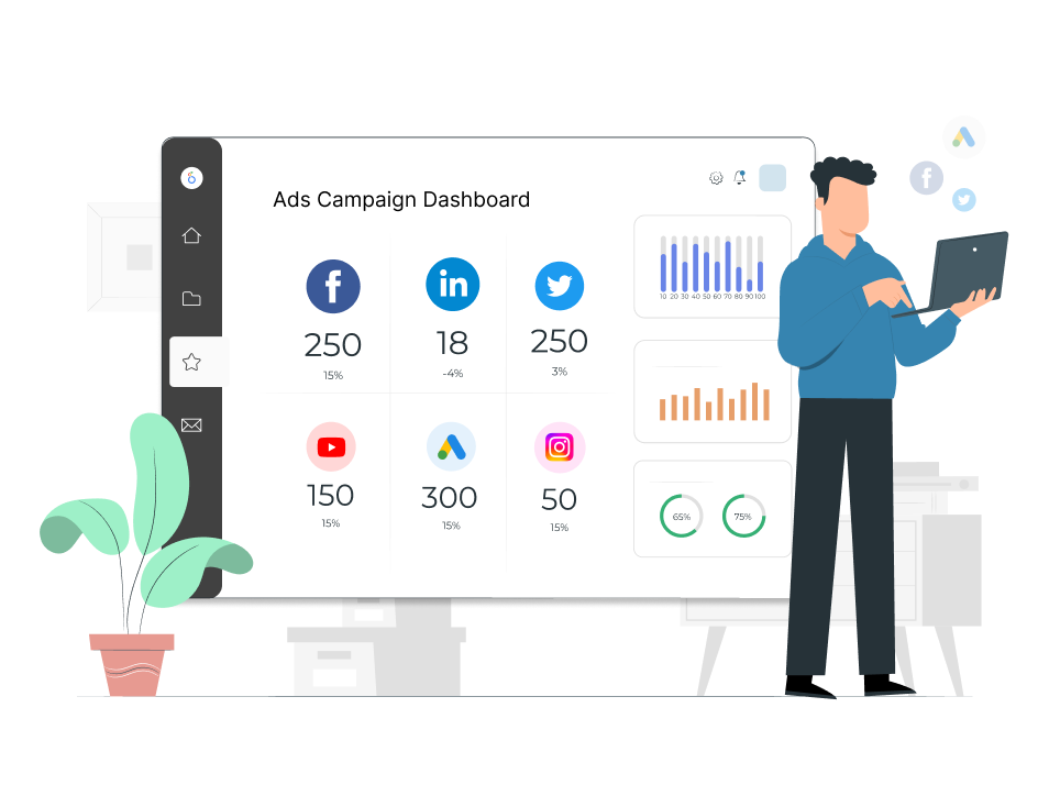
All the information you need is right at your fingertips with the Dataflo dashboard
Implementing it is simple and needless to say, it’s FREE.

Here are 3 simple steps to get you started:
Step 1: Download our pre-built template
Step 2: Integrate Dataflo with the channels you want
Your dashboard will be ready in seconds
Most marketing reports are consolidated and exhibited on a single page so that the information can be checked at a glance.
Now depending upon the goals of your business and marketing activities, a good marketing dashboard should:

Every marketer is bombarded with tons of data coming from multiple platforms and tools like customer relationship management (CRM) tools, Google Analytics, Google Search Console, Hubspot and many more.
Now, if you start pulling important data from each of the sources and then creating a report manually can be a sheer waste of time.
Moreover, collecting data isn’t the only step required for running a data-driven campaign; the data also should represent what actions need to be taken next.
There comes Looker Studio/ Google Data Studio.
While all the tools provide raw data, Looker Studio/ Google Data Studio dashboards allow you to access only the crucial data. The platform lets you build dashboards that answer all the specific questions about your marketing campaigns and audience.
This, in turn, helps your business to take the right actions for growth.
For example, a website manager would use Looker Studio/ Google Data Studio to help visualize website visitor behavior, purchase patterns, or ad performances. A social media manager could use it to present the performance of social media campaigns using metrics like reach, engagement, or conversions.
Alternatively you can also try Dataflo, a no-code platform that helps marketers visualize, analyze, and equip them to take actions on data across multiple platforms. Try it for free by signing up now.
Here are a few Looker Studio/ Google Data Studio benefits
A healthy marketing blend includes multiple strategies and tools to achieve the marketing goals. With Looker Studio/ Google Data Studio, you can connect to various data sources like-
And put the data together on the dashboard.
So whether you’re managing social media campaigns, website performance, or paid campaigns, you can easily do so by connecting multiple data sources to Looker Studio/ Google Data Studio.
Compiling and reviewing Looker Studio/ Data Studio reports with multiple data options and metrics, you may need to collaborate with other team members, account managers, and other stakeholders to get their opinions.
If you download and then send the files— it’s gonna take unnecessary time and effort, plus the files won’t get updated automatically every time you make any new changes in the dashboard. Google understands this, so Looker Studio/ Data Studio has a real-time built-in system for sharing and collaborating in real-time just like Google’s other tools.
With Looker Studio/ Google Data Studio, you can share your dashboard with others and allow them to either view or customize the reports.
Further, you can use this feature to let others make changes in real-time. This means your entire team can look at the same report together and make the necessary changes simultaneously.
Are you looking to collaborate better on metrics, share metric cards on Slack and receive notifications on metric performance? If so, it is worth your time to try Dataflo.
None like a plain and difficult-to-understand report. You need to create reports that a visually appealing and easy to read.
With Looker Studio/ Google Data Studio, you won’t need a graphic designer to create modern-looking reports. You can easily create visually appealing and engaging dashboards with just a few clicks.
Moreover, you can include some interactive features that allow the viewer to:
Looker Studio/ Data Studio allows you to customize your reports so that it can adapt to your company’s unique needs, making it easier to share and understand critical data.
You can easily customize your report’s layout or change the theme. There are plenty of fonts, colors, sizes, and more to choose from. Also, you can add anywhere from one to ten widgets per page.
The best part of the tool is that it’s completely free. You don’t need to pay for any of its features.
While Looker Studio/ Google Data studio has tons of benefits, it does come with a few limitations. Here are a few challenges of building a dashboard using Looker Studio/ Google Data Studio
Looker Studio/ Google Data Studio can seamlessly integrate with Google-owned data sources, and it’s one of the biggest advantages. However, the process of integrating becomes a bit complicated when you try to use connections and data sources outside of Google premises.
While Google allows multiple outside sources, other data visualization and BI tools do a much better job of integrating them.
If there’s any change in the base file, it won’t be automatically updated; you will have to “view” and refresh the entire report.
Data aggregation, and visualization in Looker Studio/ Google Data Studio take their sweet time to load. This includes delays in updating sources and snags in combining and staking data from tools that don’t belong to the Google ecosystem. This, in turn, slows down the entire report creation process.
Also, your team will need to invest a lot of time in figuring out what type of charts and graphs to employ for certain KPIs and metrics to help clients easily understand the data. Although you can use the pre-built templates, that could lead to a messy dashboard.
Get rid of the hassle of creating dashboards for weeks and waiting for a timeframe from the developer. Now you can build your own dashboard in less than a few minutes. Dataflo offers a free account sign-up.
If you’re an agency with a huge clientele or run big marketing campaigns with a significant number of components to track and measure, the issue with Looker Studio/ Data Studio is the limited number of available charts that you can use to showcase your metrics.
While this might not be an issue for startups or agencies with a few clients but know that with Looker Studio/ Data Studio, you will be limited to 50 components per page of visualized data. Certain charts might also have some restrictions regarding how many of them can be included on each page.
When multiple tool limitations begin to stack up, they create larger problems. That’s the case with Looker Studio/ Data Studio and complex visualizations. When you add numerous complex visualizations, they lead to lags and slow refresh rates. This, in turn, makes complex visualizations a real challenge.
The first step is logging in to Looker Studio/ Google Data Studio using your account credentials. It will show you the options of creating blank reports or customizing pre-built templates. In this tutorial, we’re going to use a Blank Report.

Now click on “Blank Report,” and then it will ask you to connect to a Data Source from which it can pull all the data. We’re going to use Google Analytics in this example.

Once you choose Google Analytics, Google will ask you to authorize Google Analytics. And when you authorize it, it will show you the list of Google Analytics accounts available with the logged-in account.
Once you’ve authorized it and chosen the right account, Looker Studio/ Data Studio will add a table on the page with Event Name and Views.

Now you can add some scorecards to display the decided metrics. To do this, choose “Insert,” which will show you a list of scorecards to display in the report.

Once you choose a scorecard, you can add any other metrics from the right panel. Just click on “Metric” from the right panel and it will show a number of metrics available. Choose the ones that you need to show in your report.

The next step would be to add a “Chart.” There are plenty of charts to choose from, like Bar Charts, Pie Charts, Time Series, etc.
To add a chart, select “Add a Chart.” In this example, we’re choosing a Bar Chart.

Again, head on to the right panel, and change the dimensions and metrics to the desired ones.
Once you’re done with adding the charts and customizing the metrics, go to “Theme and Layout” to style the dashboard so that it looks more appealing. It will show you some layout options that you can use to customize the dashboard.

Now that you’re done with adding all the details and data, you can “View” your dashboard, then check the final version and figure out if anything else needs to be added or modified.
Turn that “Untitled Report” into a “Titled Report” by giving it a proper name.

Everything is done, and now it’s time to share the report with the stakeholders so that they can make the necessary changes. And once all the changes are made, the final report can be sent to the client.
Looker Studio/ Google Data Studio is packed with features for creating basic reports for your business. However, if you’ve got a handful of clients or need to create in-depth reports for your company, it might not be the perfect tool for you. You will need a powerful Business Intelligence tool that can help you create in-depth reports in an easier and more compelling way for all your clients.
Dataflo, a no-code platform, empowers marketers to seamlessly visualize and analyze data across various platforms, aiding informed decision-making. Interested in taking your data analytics to the next level? Book a demo with Dataflo today and elevate your data-driven decision-making.


As a rising leader, Anand is dedicated to helping his team succeed by inculcating a great culture of collaboration. His passion for technology that knows no bounds has helped elevate the company to new heights. He loves photography, listening to music, and watching thriller movies. He’s also into fitness—it keeps him feeling good and healthy!